Reproducible and honest visualizations
Overview
Teaching: 90 min
Exercises: 90-120 minQuestions
How to create graphs reproducibly?
How to transmit information truthfully in graphs?
What are the good practice principles for visualizations?
Objectives
Learn about dos and donts for honest graphs
Learn about good practice for visualizations
Apply the principles to concrete examples
Learn the necessary R code
Data visualization
Data visualization is omnipresent in science. Visualizations range from presenting raw data to illustrating analysis results or modeling outcomes. The way visualizations are constructed should, as any other part of the analysis, be reproducible and adhering to the basic principles of good scientific practice. For visualizations it is specifically important to honestly show the data without distorting the contained information towards an intended message, i.e. we present how to transmit information as truthfully as possible in graphs. You will practice reproducible data analysis skills while learning about best practice for graphs.
Good practice for visualizations
In the following sections we will have a look at different visualizations and things to be aware of when using them with the goal of transmitting information truthfully. The most important principles of good practice for visualizations are
1. Be simple, clear and to the point
2. Show the data
3. Be honest about the axes
4. Use colors sensibly
We provide code in ggplot. A short introduction to ggplot is provided in this episode of the carpentries course: R for Social Scientists. A good reference for both systems, plots in base R and ggplot is the book by RD Peng: Exploratory data analysis with R.
1. Be simple, clear and to the point
Encoding data using visual cues
As a basic principle it is useful to consider the relationship of visual cues, i.e. the type of visual encoding of quantitative data such as bars or areas, and the accuracy of the understanding of a viewer of these visualizations. The graph below shows how accurately the visualizations are perceived for different types of representation. Lengths (in form of bars) represent the data most accurately while volumes are rather generic and are more difficult to be perceived accurately.
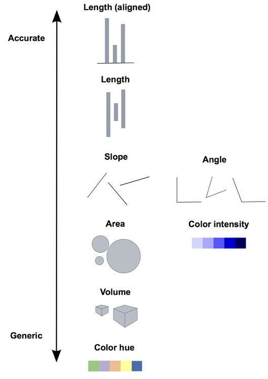 Image credit: P Aldhous
The linked picture is based on Graphical Perception: Theory, Experimentation, and Application to the Development of Graphical Methods by William S. Cleveland and Robert McGill.
Therefore, when creating a visualization you should consider the best type of visual cue that represents the data best with the goal of transmitting the intended message. For good perception of a message it is clearly better to provide simple visualizations. We discuss some specific points in more detail below.
3D
Providing simple and easily perceptible visualizations implies that you should avoid 3-dimensional graphical representations in most circumstances. Consider the following visualization:
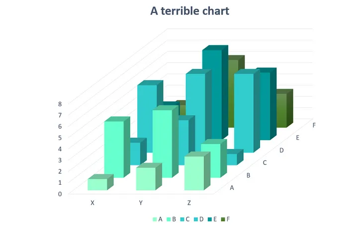
Image credit: Josh Taylor
As you can see (or not see!) some data is hidden behind the different bars. Furthermore it is rather difficult (and misleading) to compare the height from different depths.
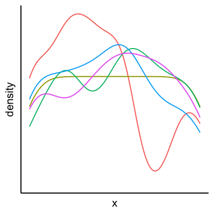
Avoid occlusion
As a general principle we can conclude from the 3D example that you should always avoid occlusion of some parts of the visualization. An example can be found in the following plot showing multiple densities in the same panel. The different densities where colored according to group but only the density in the front is fully visible.
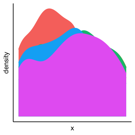
An alternative is to plot lines which allows us to see all groups completely.
Pie charts
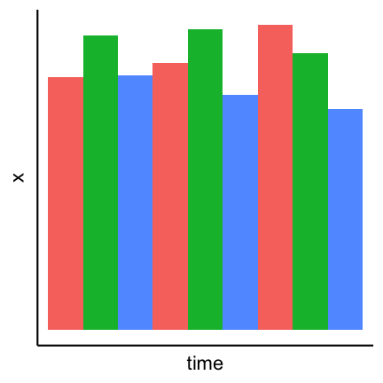
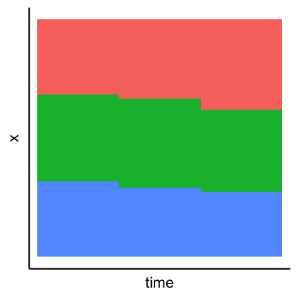
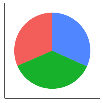
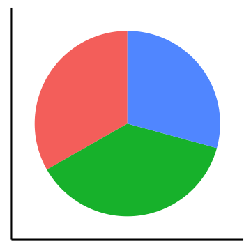
Pie charts can be considered an alternative to bar charts, although often not a good one since they use angles as visual cues. For instance look at the following three visualizations of a change of the count of three factors over time. First a barplot, second a stacked barplot and lastly three pie charts (on top of each other). Where are differences most visible?

Arrangement of plots
The arrangement of multiple plots and panels can also contribute to increasing the clarity of a visualization. Have a look at the following plot.

Two inconsistencies are present. First of all the order of the sample of the top row and the bottom row is not the same. Secondly in the top row var1 is on the y-axis while in the bottom row it is on the x-axis. Staying consistent and in general have an arrangement that makes sense helps to have a clear representation that transmits the desired information efficiently. A better alternative for the above plot is:

2. Show the data
Boxplots
Boxplots are used to give a rough overview of the distribution of a data set based on a few summary characteristics (quantiles). Consider the following three boxplots each representing a different dataset. The boxplots look identical even tough the underlying distributions may not be.
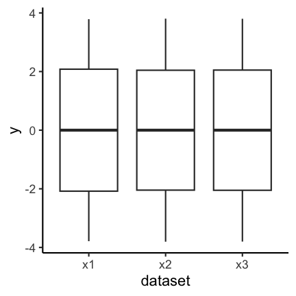
The code for the above plot:
ggplot(df_long) +
  geom_boxplot(aes(y = y, x = dataset))
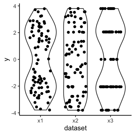
Violin plots are an alternative to boxplots. They are based on an estimation of the underlying probability density, i.e. they use more information inherent in the data set. Have a look at the following three violin plots of the same datasets as above. Again, two of the violin plots look similar but the underlying data may not be identical.

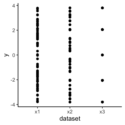
Let’s finally have a look at the actual data. As you can see the samples x1 and x3 are in fact very distinct, or more precisely, x3 seems to have only 5 possible values.
So why did the boxplot not show the distributional differences? Since boxplots only show certain quantiles (usually the quartiles, i.e., 25%, 50% and 75%, plus “outliers”) plots of different datasets having the same or similar quantiles appear identical. The quartiles of the three data sets are
| dataset | q25 | q50 | q75 |
|---|---|---|---|
| x1 | -2.1 | 0 | 2.1 |
| x2 | -2.0 | 0 | 2.0 |
| x3 | -2.0 | 0 | 2.0 |
Violin plots show a mirrored estimation of the underlying density using a smoothing technique. Loosely speaking smoothing means that starting from a histogram a smooth version of the underlying probability distribution is created. The degree of smoothing, ranging in this case from histogram to straight line, determines the actual appearence of the plot. For the violin plot the degree of smoothing is chosen automatically. Already histograms with 5 bins for the data x1 and x3 would be very similar and hence the smoothed versions thereof as well.
Caution is furthermore advised if the datasets that are compared are of very different size, because often more data gives you a higher confidence in the observed distribution. It is therefore advised to initially always have a look at the actual data and not just the summaries (like boxplots and violin plots) to detect anomalies.
Another option is the use of geom_jitter (or geom_sina from the ggforce package) in combination with violin plots:
The code for the above plot:
ggplot(df_long) +
  geom_violin(aes(y = y, x = dataset)) +
  geom_jitter(aes(y = y, x = dataset), width = 0.3)
The advantage is that individual points as well as the distribution are shown.
Boxplots together with geom_jitter are another possibility.

Another possibility is to only show the jittered data:

Bar plots
The same as discussed before for boxplots also holds for barplots. If you have continuous data and see the following barplots you might conclude that the data sets are the same:

But if you also show the individual points you can see clear differences:
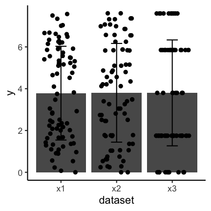
Important to keep in mind when using barplots with error bars is to state what the error bars mean. Do they correspond to the standard deviation, the standard error or a confidence interval? There is no clear answer to which one to use and, if possible, other types of visualizations should be used.
3. Be honest about the axes
The axes of plots determine how much information you provide and where you put the focus. You could cut axes, blow certain parts of an axis up through transformation or hide information on certain scales if you do not transform. You can expose or hide information by choosing the aspect ratio between the x and y axis. You can provide clear and precise information through meaningful labeling of axes and axis tick marks or you can obscure the same information by deliberately choosing uninformative tick locations, for example. These issues are illustrated through example in the following
Cutting axes
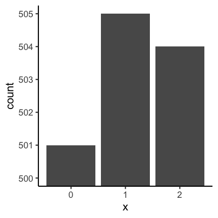
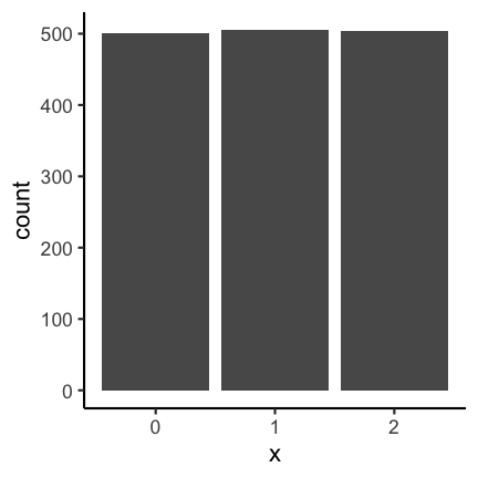
Let’s consider the following two barplots. The first has a shortened axis range and shows clear differences between the datasets. The second plot on the other hand shows the enire axis starting from zero and the differences disappear.
See this concrete example of cutting an axis, which makes differences appear much huger than they are in reality:
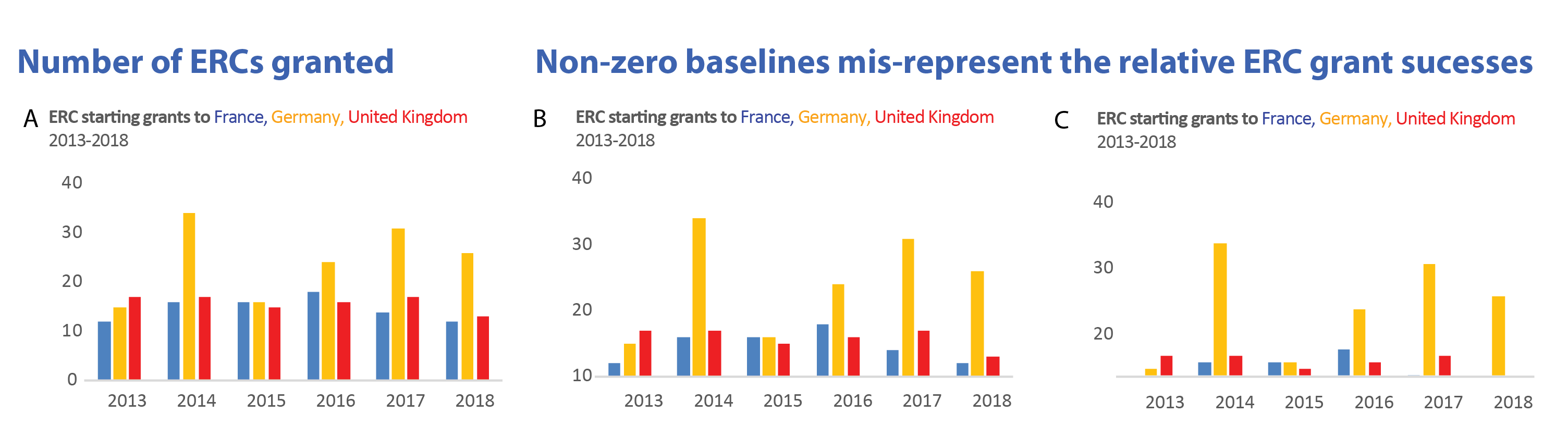 Image credit: Helena Jambor
Axis transformation
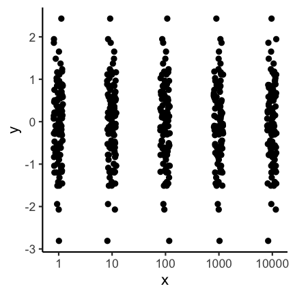
In some cases you might have data that is on completely different scales, meaning that there are differences to be seen at different orders of magnitudes. In these cases it can often to be helpful to do an axis-transformation. For instance consider the following untransformed plot:
There seems to be some structure but especially for the low values it is not clear
what is going on. If instead you do a log10 transformation of the x-axis things get
much clearer. Axis transformations are also something to consider if you have for example
non linear scales. But beware, transformations can also be used to showcase differences that do not really matter in practice.
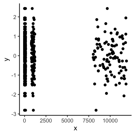
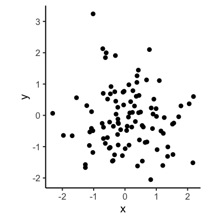
Aspect ratio
The aspect ratio is another important parameter that can be manipulated to overstress certain patterns. For example, have a look at the following two plots. The first as a ratio of one, meaning the scale of the x and y axis are the same. The second plot has an aspect ration of 1/4 meaning the x axis is substantially longer.

Code for the above plot:
ggplot(df) +
  geom_point(aes(x, y)) +
  coord_fixed(ratio = 1)
ggplot(df) +
  geom_point(aes(x, y)) +
  coord_fixed(ratio = 1 / 4)
Visually the second plot implies that the variance of x is much higher than of y, which is not the case:
summarise(df, x = var(x), y = var(y))
          x         y
1 0.8332328 0.9350631
Also consider the following real example. Where does the increase look the most dramatic?

Image credit: Demetris Christodoulou
Bin width of histograms
The appearance of a histogram is determined by the bin width that is used to create it. If you have a very large binwidth (or a low total number of bins) you might see something like this and you would probably consider the distribution to be approximately uniformly distributed.
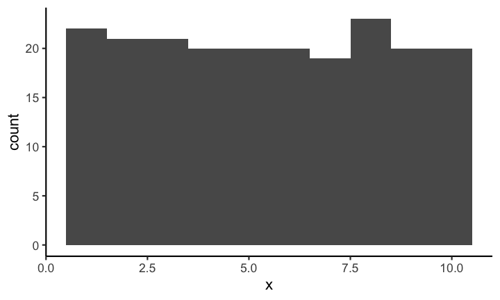
If on the other hand you decrease the binwidth (or increase the number of bins) you might see something like this:
Making it quite obvious that the distribution is most definitely not uniformly distributed (on this scale). Choosing the correct bin width is not easy and depends largely on the context.
With geom_rug you can mark the position of individual observations:

Code for the above plot:
ggplot(df, aes(x)) +
  geom_histogram(binwidth = 0.5) +
  geom_rug()
Axis scales in multiple plots
If you provide plots in multiple panels, each using the same variables, you need to pay attention to the scale of each subplot. For example have a look at the following plot.
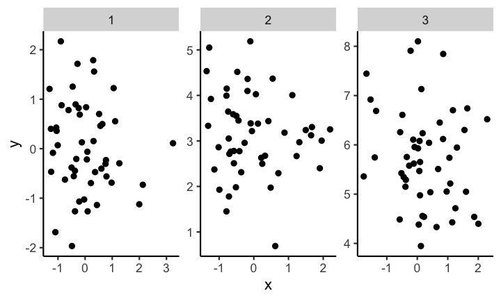
At first glance the distribution of each of the three samples looks the same. But if you look closely you can see that the scales are not the same for each subplot. If you instead keep the scale the same across subplots you get a visualization with clear differences of the distributions between the different samples.
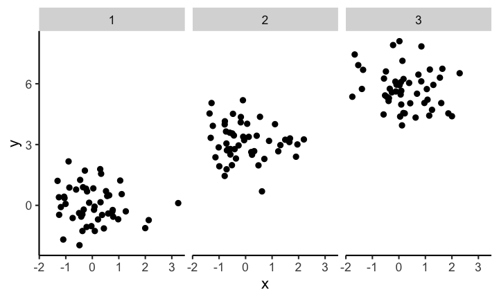
Code for the above plot:
ggplot(df) +
  geom_point(aes(x, y)) +
  facet_wrap( ~ sample)
4. Use colors sensibly
Color contrast
Trying to encode more than 8 category with colors is usually not a good idea as distinction between colors can become very difficult:
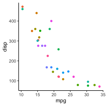
In such a case it can be a better idea to directly label the points:

Code for the above plot:
mtcars %>%
  rownames_to_column() %>%
  ggplot() +
  geom_point(aes(mpg, disp, color = cyl)) +
  ggrepel::geom_label_repel(aes(mpg, disp, label = rowname),
                            size = 2.5, label.size = 0.1,
                            label.padding = 0.1)
See also: Common pitfalls of color use in Fundamentals of Data Visualization.
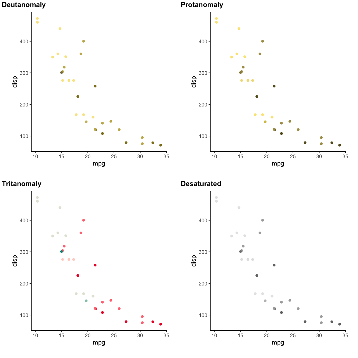
Color vision deficiency
About 1 of every 12 people is affected by some type of color vision deficiency (see, e.g., here). This is important to keep in mind when choosing colors for visualizations. For example consider the following scatter plot using a Red-Yellow-Green color palette, knowing that Red-Green colorblindness is the most frequent type of color deficiency.
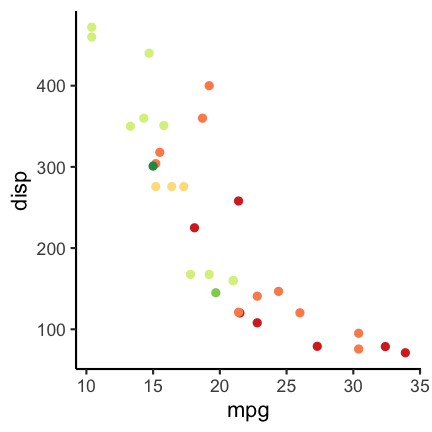
To check how the plots appear for color deficient persons you can use the cvd_grip function from the colorblindr package (install instructions on the Github colorblindr repo).
colorblindr::cvd_grid() +
  medtheme()
Using a different color palette can help. For example the following:
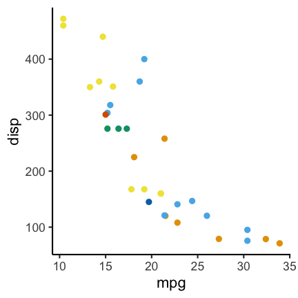
Code for the above plot:
ggplot(mtcars) +
  geom_point(aes(mpg, disp, color = factor(carb))) +
  scale_color_OkabeIto()
Another option is the dichromat package (CRAN link) which features multiple palettes for people with red-green colorblindness.
Quiz
Let’s have a look at the graph, :
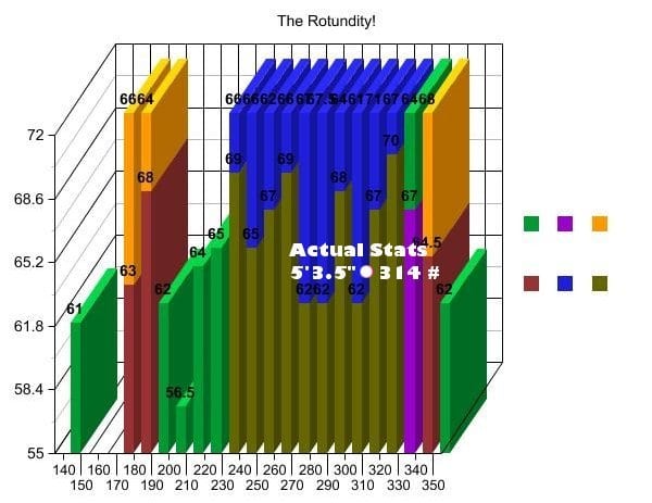 Image credit: We discovered the graph here:
https://statmodeling.stat.columbia.edu/2008/06/06/new_candidate_f/. The picture is not from a scientific study but originates from a blog: http://www.shakesville.com/2007/09/rotundity-revealed.html.
Image credit: We discovered the graph here:
https://statmodeling.stat.columbia.edu/2008/06/06/new_candidate_f/. The picture is not from a scientific study but originates from a blog: http://www.shakesville.com/2007/09/rotundity-revealed.html.
1
What aspect of the “Be simple, clear and to the point” input has been violated?
- 3D
- occlusion
- use of pie charts
- arrangement of multiple plots
Solution
T 3D
T occlusion
F use of pie charts
F arrangement of multiple plots
2
Is the data shown appropriately by the plot through
- the height of bars?
- the values on bars?
- additional values in white font?
- the tick marks indicating to which value each bar belongs?
- the raw data?
Solution
- the height of bars?
- the values on bars?
- additional values in white font?
- the tick marks indicating to which value each bar belongs?
- the raw data?
3
What could be the reason that the Y-axis is shown starting at the value 55?
- the value 55 could be the smallest possible value in the context
- the differences between the bars are more pronounced than if the Y-axis starts at zero.
- the values below 55 need to be hidden
Solution
T the value 55 could be the smallest possible value in the context
T the differences between the bars are more pronounced than if the Y-axis starts at zero.
T the values below 55 need to be hidden
4
When you think about the information regarding the axes, please tick which one of the following items is present in the plot
- Sensible X-axis tick label display
- Sensible X-axis label
- Sensible Y-axis tick values
- Sensible Y axis label
Solution
F Sensible X-axis tick label display
F Sensible X-axis label
F Sensible Y-axis tick values
F Sensible Y axis label
5
Does the displayed grid help to determine the height of the color sections of the bars?
- Yes
- No
Solution
F Yes
T No
6
Is the used color palette color-blind friendly?
- Yes
- No
Solution
F Yes
T No
7
Which of the following additional information items does the plot feature?
- Informative title
- Informative legend labels
- Provenance of data
- Context of data
Solution
F Informative title
F Informative legend labels
F Provenance of data
F Context of data
8
Does the course team think this is a good plot?
- Yes
- No
Solution
F Yes
T No
Episode challenge
For this challenge we will work with climate data published by the Bundesamt für Statistic BFS in which various climate related variables measured at different locations in Switzerland have been put together. The data has already been wrangled into a csv file that you can download from here.
The source data was downloaded from here: https://www.bfs.admin.ch/asset/de/je-d-02.03.03.02 and here: https://www.bfs.admin.ch/asset/de/je-d-02.03.03.03
Task 1: data exploration
In this first task read in the climate_data.csv file and do a short exploration of the dataset.
1.1 First look
Show the top 3 rows of the dataset and additionally a short summary of the dataset (Hint: use summary). Describe what you observe in a few words.
Solution
head(climatedf_comp, n = 3)Year Location Sunshine_duration Altitude Annual_Precipitation 1 1931 BaselBinningen 1594.317 316 816.0 2 1931 BernZollikofen 1742.500 553 1137.6 3 1931 Davos 1767.600 1594 1077.3 Annual_temperature Annual_ice_days Annual_frost_days Annual_summer_days 1 8.5 NA NA NA 2 7.2 NA NA NA 3 1.7 NA NA NA Annual_heat_days Annual_tropic_days Annual_precipitation_days 1 NA NA NA 2 NA NA NA 3 NA NA NAsummary(climatedf_comp)Year Location Sunshine_duration Altitude Min. :1931 Length:1170 Min. :1046 Min. : 273.0 1st Qu.:1953 Class :character 1st Qu.:1557 1st Qu.: 411.0 Median :1976 Mode :character Median :1725 Median : 485.0 Mean :1976 Mean :1759 Mean : 805.9 3rd Qu.:1998 3rd Qu.:1937 3rd Qu.: 776.0 Max. :2020 Max. :2741 Max. :2501.0 NA's :129 Annual_Precipitation Annual_temperature Annual_ice_days Annual_frost_days Min. : 338.9 Min. :-3.300 Min. : 0.00 Min. : 1.00 1st Qu.: 829.9 1st Qu.: 6.925 1st Qu.: 5.00 1st Qu.: 60.25 Median :1050.5 Median : 9.000 Median : 17.00 Median : 87.00 Mean :1212.9 Mean : 7.755 Mean : 33.05 Mean :107.99 3rd Qu.:1411.8 3rd Qu.:10.400 3rd Qu.: 41.00 3rd Qu.:120.00 Max. :3704.2 Max. :13.900 Max. :218.00 Max. :289.00 NA's :364 NA's :364 Annual_summer_days Annual_heat_days Annual_tropic_days Min. : 0.00 Min. : 0.000 Min. : 0.000 1st Qu.: 12.25 1st Qu.: 0.000 1st Qu.: 0.000 Median : 38.00 Median : 2.000 Median : 0.000 Mean : 36.95 Mean : 6.257 Mean : 1.561 3rd Qu.: 56.00 3rd Qu.:10.000 3rd Qu.: 1.000 Max. :125.00 Max. :56.000 Max. :40.000 NA's :364 NA's :364 NA's :364 Annual_precipitation_days Min. : 64.0 1st Qu.:100.0 Median :120.0 Mean :119.8 3rd Qu.:136.0 Max. :229.0 NA's :365
1.2 Which has been the hottest year?
Solution
climatedf_comp %>%
  dplyr::group_by(Year) %>%
  dplyr::summarise(mean_temp = mean(Annual_temperature)) %>%
  dplyr::filter(mean_temp == max(mean_temp)) %>%
  dplyr::pull(Year)
[1] 2018
1.3 Which has been the coldest year?
Solution
climatedf_comp %>%
  dplyr::group_by(Year) %>%
  dplyr::summarise(mean_temp = mean(Annual_temperature)) %>%
  dplyr::filter(mean_temp == min(mean_temp)) %>%
  dplyr::pull(Year)
[1] 1956
Task 2: visualization
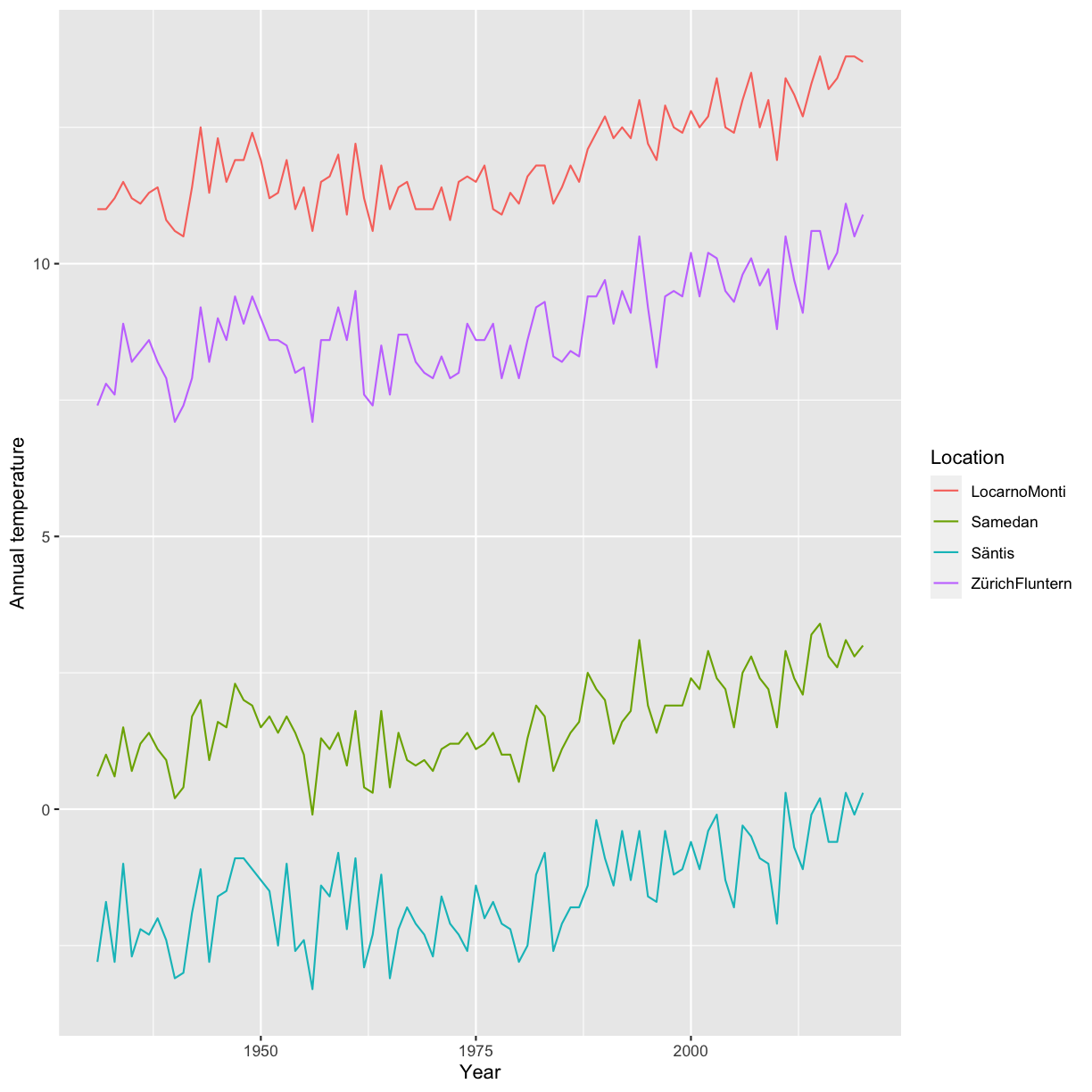
2.1 Association of Annual_temperature and Year
The goal is to visualize the association of Annual_temperature and Year.
To increase the visibility we will only look at the locations ZürichFluntern, Säntis, Samedan, LocarnoMonti.
Choose a suitable visualization (maybe consider looking at the decision tree) and plot the respective graph.
Solution
climatedf_comp %>%
  dplyr::filter(Location %in% c("ZürichFluntern",
                                "Säntis",
                                "Samedan",
                                "LocarnoMonti")) %>%
  ggplot() +
  geom_line(aes(Year, Annual_temperature, color = Location)) +
  labs(y = "Annual temperature")
2.2 Add information on the altitude
Based on the previous plot update / change your plot to also include the information about the altitude. Make sure that the location information is also provided.
Solution
climatedf_comp %>%
  dplyr::filter(Location %in% c("ZürichFluntern",
                                "Säntis",
                                "Samedan",
                                "LocarnoMonti")) %>%
  ggplot() +
  geom_line(aes(Year, Annual_temperature, color = Altitude, group = Location)) +
  geom_label(aes(Year, Annual_temperature, label = Location),
             data = climatedf_comp %>%
               dplyr::filter(Location %in% c("ZürichFluntern",
                                             "Säntis",
                                             "Samedan",
                                             "LocarnoMonti")) %>%
               dplyr::filter(Year==min(Year)+5),nudge_y = 1) +
  labs(y = "Annual temperature")

2.3 Normalization
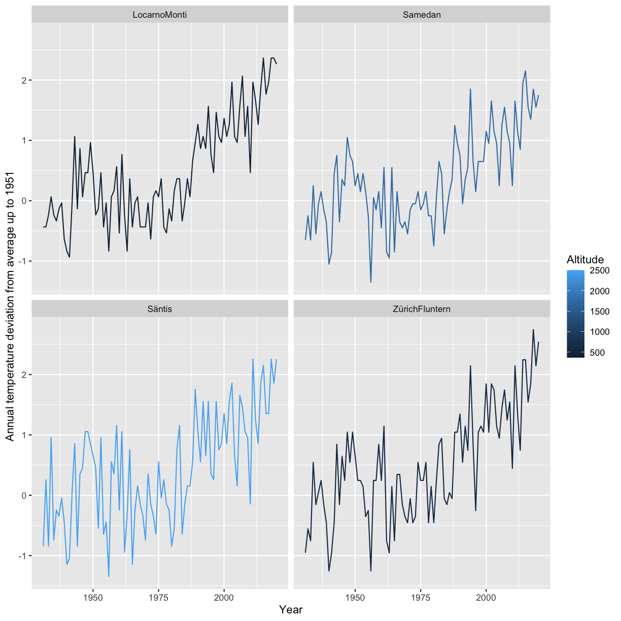
In the next step we want to normalize the Annual temperature by using the values of the years <1951 as a base. I.e. calculate the mean Annual_temperature for Year<1951 for each Location and subtract this value from Annual_temperature. Present a visualization that allows to study the deviation from this annual mean by location.
Solution
climatedf_comp_translated <- climatedf_comp %>%
  dplyr::filter(Location %in% c("ZürichFluntern",
                                "Säntis",
                                "Samedan",
                                "LocarnoMonti")) %>%
  dplyr::group_by(Location) %>%
  dplyr::mutate(mean_temperature = mean(Annual_temperature[Year < 1951]),
                Annual_temperature = Annual_temperature - mean_temperature)

ggplot(climatedf_comp_translated) +
  geom_line(aes(Year, Annual_temperature, color = Altitude, group = Location)) +
  facet_wrap( ~ Location) +
  # geom_label(aes(Year, Annual_temperature, label = Location),
  #            data = climatedf_comp_translated %>%
  #              dplyr::filter(Location %in% c("ZürichFluntern",
  #                                            "Säntis",
  #                                            "Samedan",
  #                                            "LocarnoMonti")) %>%
  #              dplyr::filter(Year == min(Year) + 5), nudge_y = 1) +
  labs(y = "Annual temperature deviation from average up to 1951")
2.4 Associations between Annual_Precipitation, and Sunshine_duration
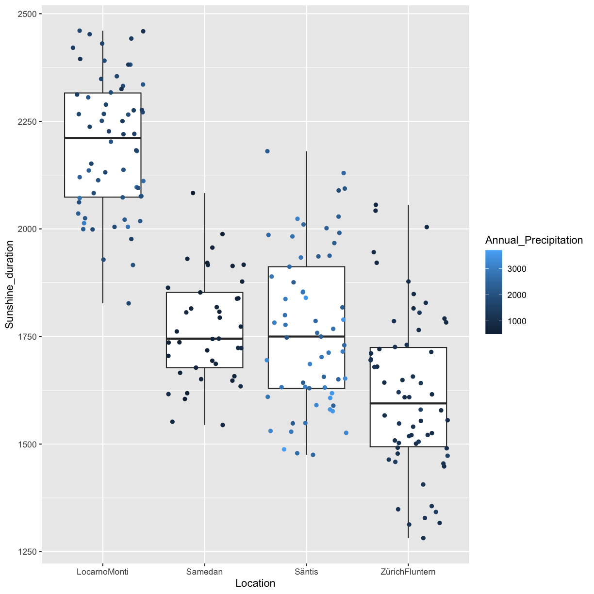
The next goal is to explore associations between Annual_Precipitation, and Sunshine_duration for the locations ZürichFluntern,Säntis,Samedan,LocarnoMonti. Present at least two different types of plots.
Solution
climatedf_comp %>%
  dplyr::filter(Location %in% c("ZürichFluntern",
                                "Säntis",
                                "Samedan",
                                "LocarnoMonti")) %>%
  tidyr::drop_na() %>%
  ggplot() +
  geom_point(aes(Annual_Precipitation, Sunshine_duration, color = Location))
climatedf_comp %>%
  dplyr::filter(Location %in% c("ZürichFluntern",
                                "Säntis",
                                "Samedan",
                                "LocarnoMonti")) %>%
  # dplyr::group_by(Location) %>%
  # dplyr::mutate(Sunshine_duration = scale(Sunshine_duration)) %>%
  tidyr::drop_na() %>%
  ggplot() +
  geom_violin(aes(Location, Annual_Precipitation, color = Sunshine_duration)) +
  ggforce::geom_sina(aes(Location, Annual_Precipitation, color = Sunshine_duration))
Warning: The following aesthetics were dropped during statistical transformation: colour ℹ This can happen when ggplot fails to infer the correct grouping structure in the data. ℹ Did you forget to specify a `group` aesthetic or to convert a numerical variable into a factor?
climatedf_comp %>%
  dplyr::filter(Location %in% c("ZürichFluntern",
                                "Säntis",
                                "Samedan",
                                "LocarnoMonti")) %>%
  # dplyr::group_by(Location) %>%
  # dplyr::mutate(Sunshine_duration = scale(Sunshine_duration))  %>%
  tidyr::drop_na() %>%
  ggplot() +
  geom_boxplot(aes(Location, Sunshine_duration, color = Annual_Precipitation)) +
  geom_jitter(aes(Location, Sunshine_duration, color = Annual_Precipitation))
Warning: The following aesthetics were dropped during statistical transformation: colour ℹ This can happen when ggplot fails to infer the correct grouping structure in the data. ℹ Did you forget to specify a `group` aesthetic or to convert a numerical variable into a factor?
# ggforce::geom_sina(aes(Location, Annual_Precipitation, color = Sunshine_duration))


Bonus challenge
We have already shortly had a look at facets which allow to easily arrange multiple plots. But so far we have only considered the case where each subplot shows the same variables, e.g Sunshine_duration vs. Annual_frost_days. What if instead you would like to use facets to plot multiple variables? For instance you would like to do a plot containing two subplots, the first Annual_frost_days vs. Sunshine_duration and the second Annual_summer_days vs. Sunshine_duration?
There are basically two options:
- Do both plots separately and then combine them
- Do both plots simultaneously using facets
We will in the following explore both options.
Combine plots
There are many options available how to combine plots. Two useful packages are cowplot (for all graphics) and ggpubr (for ggplots). In this exercise we will use ggpubr.
Exercise 1
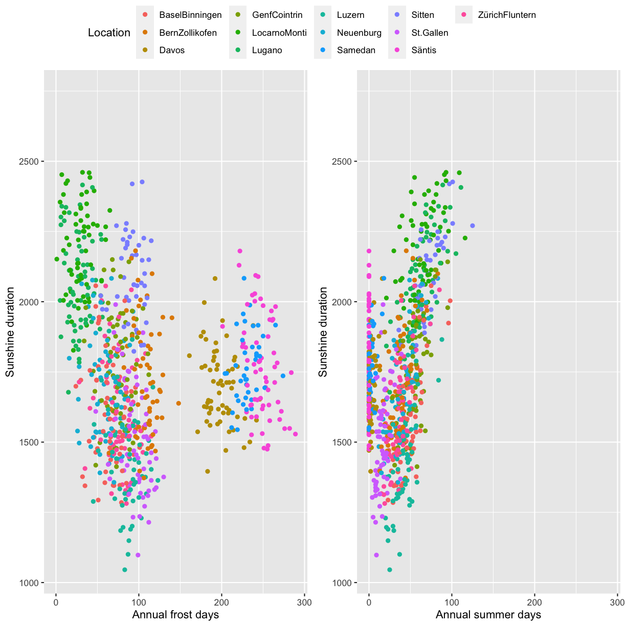
Create two ggplot2 scatterplots, Annual_frost_days vs. Sunshine_duration and Annual_summer_days vs. Sunshine_duration, color by location. Combine the two plots using ggpubr::ggarrange and make sure to have only one legend. Also make sure to have the same axis range in both plots.
Solution
minmax <- c(min=min(na.omit(c(climatedf_comp$Annual_frost_days,
                              climatedf_comp$Annual_summer_days))),
               max=max(na.omit(c(climatedf_comp$Annual_frost_days,
                                 climatedf_comp$Annual_summer_days))))
pl1 <- climatedf_comp %>%
  ggplot() +
  geom_point(aes(Annual_frost_days, Sunshine_duration, color = Location)) +
  xlim(minmax)+
  labs(x="Annual frost days",
       y="Sunshine duration")

pl2 <- climatedf_comp %>%
  ggplot() +
  geom_point(aes(Annual_summer_days, Sunshine_duration, color = Location)) +
  xlim(minmax)+
  labs(x="Annual summer days",
       y="Sunshine duration")

ggpubr::ggarrange(pl1, pl2, common.legend = TRUE)
Facets
The second option is to use facets (e.g. ggplot2::facet_wrap). Since our data is
currently not in the correct format we first have to bring it into shape. This can be done using
tidyr::pivot_longer which transforms data from wide to long format. The wide format means we have multiple values per row while the long format means we only have a single value while the remaining
columns act as an identifier of the sample. You can learn more about pivot, long and wide formats by running vignette("pivot",package = "tidyr") in the console.
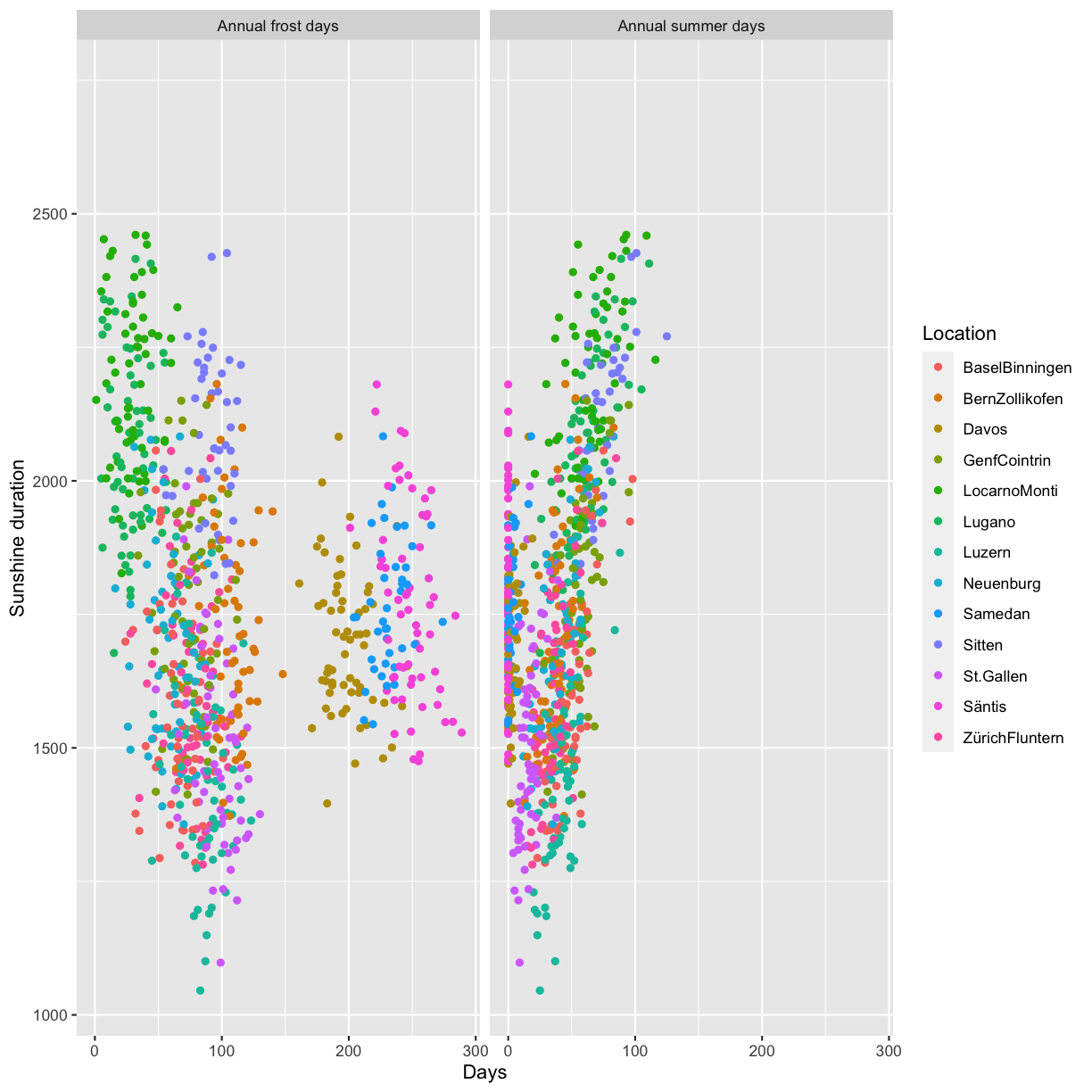
Exercise 2
Use tidyr::pivot_longer to bring the data into long format and plot Annual_frost_days vs. Sunshine_duration and Annual_summer_days vs. Sunshine_duration in the same plot using ggplot2::facet_wrap.
Hint: The columns to pivot into longer format are Annual_frost_days and Annual_summer_days.
Solution
climatedf_comp %>%
  dplyr::select(Location, Year, Sunshine_duration,
                Annual_frost_days, Annual_summer_days) %>%
  dplyr::rename(`Annual frost days` = Annual_frost_days,
                `Annual summer days` = Annual_summer_days) %>%
  tidyr::pivot_longer(cols = c("Annual frost days", "Annual summer days")) %>%
  ggplot() +
  geom_point(aes(value, Sunshine_duration, color = Location)) +
  facet_wrap( ~ name) +
  labs(x = "Days", y = "Sunshine duration")
Optional: ggplot2 theme
Rotate axis text
In some situations where labels on the x-axis are long they can overlap with the default setting:

A solution can be to rotate the labels:

Reproduce the above plot.
Hint: use the argument axis.text.x in the theme function and make sure to check the expected input class in axis.text.x.
Solution
climatedf_comp %>%
  ggplot() +
  geom_violin(aes(Location, Sunshine_duration, color = Location)) +
  theme(axis.text.x = element_text(angle = 45, hjust = 1)) +
  labs(y = "Sunshine duration", x = "")
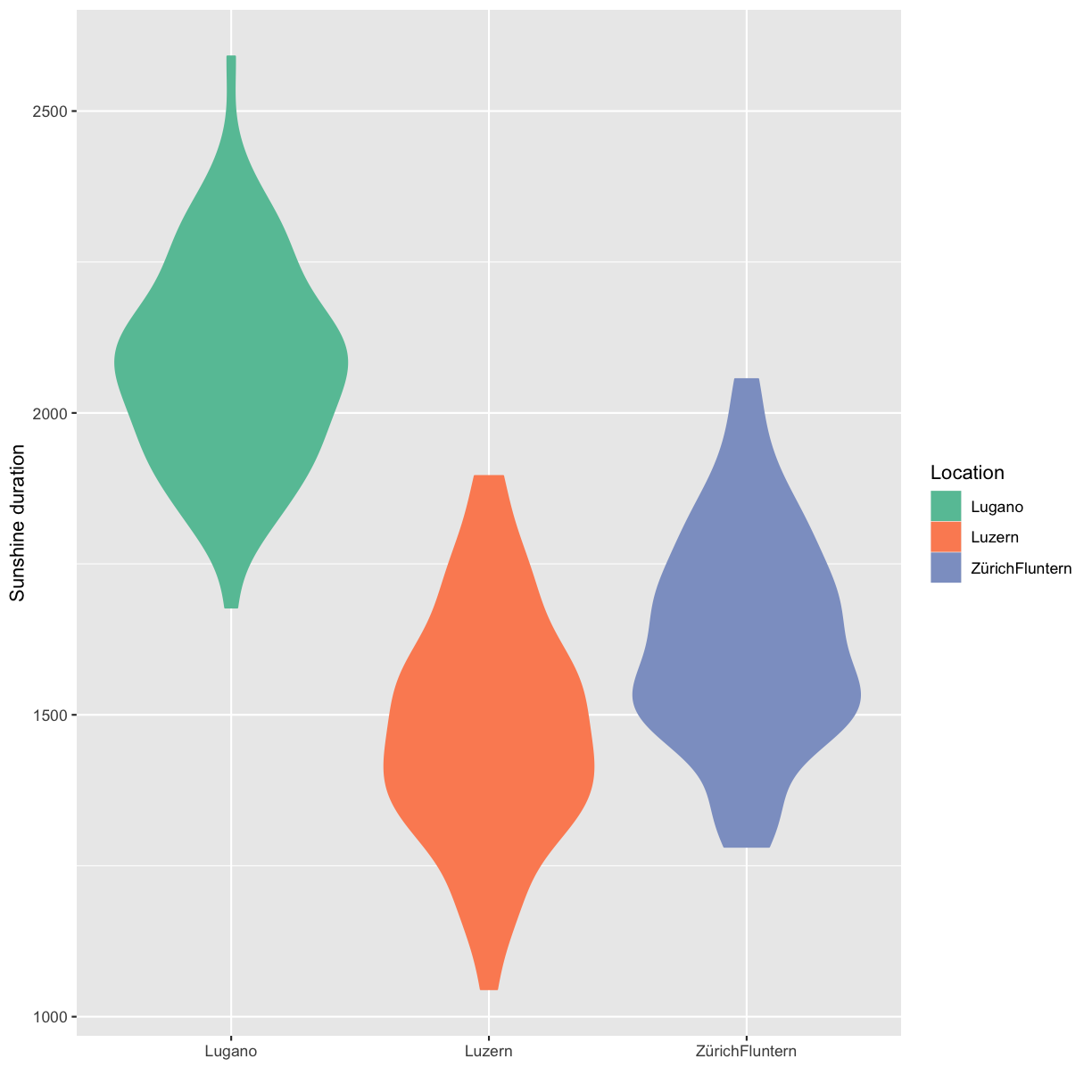
Custom colors
You can generate custom colors using RColorBrewer::brewer.pal. The generated colors can then be used in combination with scale_color_manual(values=generated_colors).
Solution
climatedf_comp_red <- climatedf_comp[climatedf_comp$Location %in%
                                       c("Luzern","ZürichFluntern","Lugano"), ]
colors_use <- RColorBrewer::brewer.pal(length(unique(climatedf_comp_red$Location)),
                                       "Set2")

climatedf_comp_red %>%
  ggplot() +
  geom_violin(aes(Location, Sunshine_duration, color = Location, fill = Location)) +
  scale_color_manual(values = colors_use) +
  scale_fill_manual(values = colors_use) +
  labs(y = "Sunshine duration", x = "")
Key Points
Be simple, clear and to the point
Show the data
Be honest about the axes
Use colors sensibly