Scientific integrity, Open Science and reproducibility
Overview
Teaching: 60 min
Exercises: 60-90 minQuestions
What is Scientific integrity and what is the link to Open Science and reproducibility?
What is Open Science and which aspects are important to me?
What is reproducibility and why should I care about it?
Objectives
Understand the connections between scientific integrity, Open Science and reproducibility
Name the requirements on designing, carrying out and reporting of research projects such that scientific integrity is respected
Discrimate between so-called negative and positive results
List all/many of the dimensions of Open Science
Explain why and know where to preregister studies
Apply these concepts when reading about research
1. What is scientific integrity and what is the link to Open Science and reproducibility?
Scientific/research integrity at the University of Zurich
Often when the term “Scientific integrity” comes up one would think about topics such as
-
Misconduct/ fraud procedures
https://www.research.uzh.ch/de/procedures/integrity.html -
Ethical issues, especially regarding research on humans and on animals
https://www.uzh.ch/cmsssl/en/researchinnovation/ethics.html -
Conflicts of interest
https://www.uzh.ch/prof/apps/interessenbindungen/client/
Note that conflicts of interest can also be the subject of studies: https://doi.org/10.1186/s13643-020-01318-5
For each of these topics we have the University of Zurich links here, most other universities will also have corresponding regulations in place. But these topics are not the main interest of this course, we will instead focus at the aspects of research integrity discussed below.
National and international guidance documents on research integrity
Several guidance documents exist, see three European examples here:
-
Towards a Research Integrity Culture at Universities (LERU)
https://www.leru.org/publications/towards-a-research-integrity-culture-at-universities-from-recommendations-to-implementation -
The European Code of Conduct for Research Integrity
https://allea.org/code-of-conduct/ -
Scientific Integrity at the Swiss Academies of Arts and Sciences
https://akademien-schweiz.ch/en/uber-uns/kommissionen-und-arbeitsgruppen/wissenschaftliche-integritat/
⇒ We will have a brief look at each of the documents and work on the Swiss document in more detail.
LERU: Towards a research integrity culture at Universities
In a summary chapter the guidance document states what Universities should do to empower sound research:
Improve the design and conduct of research:
- statistics, research design, methodology and analysis
- newest standards
- understanding limitations
- checklists to improve design
Improve the soundness of reporting
- reporting guidelines
- pre-registration
- publish all components of experimental design.
- Value negative results and replication studies
⇒ The points in bold are topics of this course and directly related to reproducibility as we will see below and later.
European code of conduct for research integrity
The EU code states that Good research practices are based on fundamental principles of research integrity.
-
Reliability in ensuring the quality of research, reflected in the design, the methodology, the analysis and the use of resources.
-
Honesty in developing, undertaking, reviewing, reporting and communicating research in a transparent, fair, full and unbiased way.
-
Respect for colleagues, research participants, society, ecosystems, cultural heritage and the environment.
-
Accountability for the research from idea to publication, for its management and organisation, for training, supervision and mentoring, and for its wider impacts.
⇒ You will find these same main principles in the Swiss guidance document! Adhering to the principles of reliability, honesty and accountability requires, among other aspects, to work reproducibly and openly.
The Swiss code of conduct for scientific integrity
The same principles occur in the Swiss document, here with a direct pointer to reproducibility:
“Reliability, honesty, respect, and accountability are the basic principles of scientific integrity. They underpin the independence and credibility of science and its disciplines as well as the accountability and reproducibility of research findings and their acceptance by society. As a system operating according to specific rules, science has a responsibility to create the structures and an environment that foster scientific integrity.”
Quiz on the Swiss code of conduct for scientific integrity
For these questions, please read or search the Code until page 26.
Audience
At which of the following groups of people is the code of conduct aimed at?
- researchers at research performing institutions
- educators at higher education institutions
- administrative staff at research performing institutions
- students at higher education institutions
Solution
T researchers at research performing institutions
T educators at higher education institutions
F administrative staff at research performing institutions
T students at higher education institutions
Reliability
For reliability researchers need to use, e.g.,
- appropriate study designs
- the most current methods
- simple analysis methods
- transparent reporting
- traceable materials and data
Solution
T appropriate study designs
F the most current methods
F simple analysis methods
T transparent reporting
T traceable materials and data
Computer code
The code does not mention reproducible code (in the sense of computer code) directly. Find an implicit location where the use of reproducible code is implied by the standards of Chapter 4. Copy the entire bullet point or just the relevant verb.
Solution
The Code states “Researchers should design, undertake, analyse, document, and publish their research with care and with an awareness of their responsibility to society, the environment, and nature.” Using a scripting language for data analysis and providing the corresponding code hence caters to the “documenting” step.
Negative results
The non-publication of so-called negative results can be seen as a violation of scientific integrity. Find the behavior in Chapter 5 of the Code which this can be related to.
Solution
The Code lists “omitting or withholding data and data sources” as a behavior wich is an examples of scientific misconduct.
Example
Publication of negative results
Therapeutic fashion and publication bias: the case of anti-arrhythmic drugs in heart attack
- In the 1970s, it was found that the local anaesthetic drug lignocaine (lidocaine) suppressed arrhythmias after heart attacks
- That this claim was wrong was difficult to recognise from small clinical trials looking only at effects on arrhythmias, not outcomes that really matter, like deaths.
- Large clinical trials in the late 1980s showed that the drugs actually increased mortality.
- The results of Hampton and co-authors’ small but negative trial regarding the anti-arrhythmic agent lorcainide were not published because no journal was willing to do so at the time.
- A cumulative meta-analysis of previous anti-arrhythmic trials would have helped avoid tens of thousands of unnecessarily early deaths, even more so if results like those of Hampton and co-authors would have been available.
- With the words ‘publication bias’ in the title, the trial results could finally be published in the early 1990s:
Therapeutic fashion and publication bias: the case of anti-arrhythmic drugs in heart attackJ Hampton https://journals.sagepub.com/doi/10.1177/0141076815608562
Bottom line: This is a very impressive example of the consequences of non-publication of “negative” results. The authors themselves are not to blame, they have maintained their integrity as researchers. The example shows that the publication of all results is indeed a principle of research integrity in the sense of the integrity of the research record as a whole.
2. What is Open Science?
Let´s play the game “Open up your research”
https://www.openscience.uzh.ch/de/moreopenscience/game.html
Dimensions of Open Science
Which decisions did Emma need to take in the game?
Solution
- Involve a librarian?
- Write a data management plan?
- Preregister her research plan?
- Make her data FAIR?
- Publish Open Access?
- Publish data and/or code?
UNESCO recommendation on Open Science
In 2021 UNESCO published their recommendations for Open Science. From their point of view Open Science is a tool helping to create a sustainable future. In the bold face part of the quote we see the link of Open Science to scientific integrity and also reproducibility:
“Building on the essential principles of academic freedom, research integrity and scientific excellence, open science sets a new paradigm that integrates into the scientific enterprise practices for reproducibility, transparency, sharing and collaboration resulting from the increased opening of scientific contents, tools and processes.”
 Image credit: UNESCO Recommendation on Open Science, CC-BY-SA.
Optional: Read the full recommendation text at https://en.unesco.org/science-sustainable-future/open-science/recommendation.
Open Science made easy by the Open Science in Psychology/Social Science initiatives
The Open Science in Psychology/Social Science initiatives summarize and explain the practice of Open Science in seven steps: https://osf.io/hktmf/. Some of these steps were also part of Emma’s decision process. Here we show an abbreviated version of the seven steps:
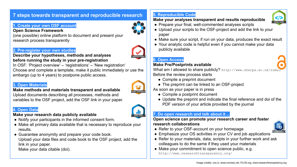
Image credit: Eva Furrer, unlicensed, abbreviated version of https://osf.io/hktmf/.
We will revisit the following steps in this lesson:
- Create OSF account (use easy infrastructure for collaboration)
- Pregregister your own studies
- Open Data
- Reproducible Code
- Open Access (preprints)
What is preregistration?
The Open up your research game and the seven steps above refer to preregistration. But what is preregistration? The Texas sharp shooter cartoon shows an unregistered experiment. The shooter first shoots and then draws the bull´s eyes around his shots. He did not preregister where he wanted to shoot before shooting.
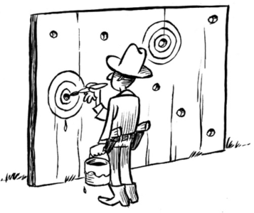
Image credit: Illustration by Dirk-Jan Hoek, CC-BY.
When a researcher preregisters a study, the design and precise goal of the study are declared openly in advance: the bull´s eye is drawn.
Origins of preregistration: clinical trials
A clinical trial is an experiment involving human volunteers for example in the development of a new drug. Registration of clinical trials, i.e. announcing that a trial will be conducted and what its goal is before any data are collected, has become a standard since the late 1990s. It is considered a scientific, ethical and moral responsibility for all trials because:
- Informed decisions are difficult under publication bias and selective reporting, i.e. the non-publication negative results and the focus on publication of positive results which might not reflect the original goals. Publication bias and selective reporting result in a biased view of the situation.
- Describing clinical trials in progress simplifies identification of research gaps
- The early identification of potential problems contributes to improvements in the quality
⇒ The Declaration of Helsinki requires since the late 1990s: “Every clinical trial must be registered […]”
Registries (non-exhaustive list)
Here is a list of registries, where (pre)registration can be done:
Clinicaltrials.gov: US and international registry for clinical trials, first of its kind, established 1997: https://clinicaltrials.gov/
OSF: General purpose registry, also a research management tool (not just for preregistration), embargo possible for up to 4 years: https://osf.io/
Aspredicted: General purpose registry, protocols can be private forever, possibility to automatically delete an entry after 24 hours:
https://aspredicted.org/Preclinicaltirals.ed: Comprehensive listing of preclinical animal study protocols
https://preclinicaltrials.eu/PROSPERO International prospective register of systematic reviews
https://www.crd.york.ac.uk/prospero/


Quiz on registration
Does registration show an effect?
All large National Heart Lung, and Blood Institute (NHLBI) supported randomized controlled trials between 1970 and 2012 evaluating drugs or dietary supplements for the treatment or prevention of cardiovascular disease are shown with their reported outcome measure in the graphic. Trials were included if direct costs were bigger than 500,000$/year, participants were adult humans, and the primary outcome was cardiovascular risk, disease or death.
Image Credit: R Kaplan and V Irvin https://journals.plos.org/plosone/article?id=10.1371/journal.pone.0132382, CC-BY.What is the difference between what you observe before and after the year 2000 in this graphic?

Solution
Before 2000 one sees many positive effects, i.e. treatments that lower the relative risk of cardiovascular disease, but also null effects, in general the effects are larger. After registration of the primary outcome becomes mandatory, less outcome switching can occur and many more null effects are reported. The policy change helped to overcome this particular aspect of selective reporting.
3. What is reproducibility?
Reproducibility vs replicability
Reproducibility refers to the ability of a researcher to duplicate the results of a prior study using the same materials as were used by the original investigator. This requires, at minimum, the sharing of data sets, relevant metadata, analytical code, and related software.
Replicability refers to the ability of a researcher to duplicate the results of a prior study if the same procedures are followed but new data are collected.
See S Goodman et al. https://www.science.org/doi/10.1126/scitranslmed.aaf5027 for a finer grained discussion of the concepts.
What is reproducibility?
“This is exactly how it seems when you try to figure out how authors got from a large and complex data set to a dense paper with lots of busy figures. Without access to the data and the analysis code, a miracle occurred. And there should be no miracles in science.”
See artwork by Sidney Harris at http://www.sciencecartoonsplus.com/ for an illustration of the remark “I think you should be more explicit here in step two” when a miracle occurs.
The quote is from F Markowetz https://genomebiology.biomedcentral.com/articles/10.1186/s13059-015-0850-7. In this publication the author asks what working reproducibly means for his daily work and comes up with “Five selfish reasons to work reproducibly”, this is even the title of the paper.
“Working transparently and reproducibly has a lot to do with empathy: put yourself into the shoes of one of your collaboration partners and ask yourself, would that person be able to access my data and make sense of my analyses. Learning the tools of the trade will require commitment and a massive investment of your time and energy. A priori it is not clear why the benefits of working reproducibly outweigh its costs.”
In this course we will learn about some of the tools Markowetz lists in his paper.
(Anti-)Example from the Markowetz paper
How bright promise in cancer testing fell apart
Image Credit: adapted from the open access article by K Baggerly and K Coombes https://projecteuclid.org/journals/annals-of-applied-statistics/volume-3/issue-4/Deriving-chemosensitivity-from-cell-lines–Forensic-bioinformatics-and-reproducible/10.1214/09-AOAS291.full.
From G Kolata https://www.nytimes.com/2011/07/08/health/research/08genes.html.
“When Juliet Jacobs found out she had lung cancer, she was terrified, but realized that her hope lay in getting the best treatment medicine could offer. So she got a second opinion, then a third. In February of 2010, she ended up at Duke University, where she entered a research study whose promise seemed stunning.
Doctors would assess her tumor cells, looking for gene patterns that would determine which drugs would best attack her particular cancer. She would not waste precious time with ineffective drugs or trial-and-error treatment. The Duke program — considered a breakthrough at the time — was the first fruit of the new genomics, a way of letting a cancer cell’s own genes reveal the cancer’s weaknesses.
But the research at Duke turned out to be wrong. Its gene-based tests proved worthless, and the research behind them was discredited. Ms. Jacobs died a few months after treatment, and her husband and other patients’ relatives have retained lawyers.”
Markowetz wonders in his paper why no one noticed these issues before it was too late. And he comes to the conclusion that the reason was that the data and analysis were not transparent and required forensic bioinformatics to untangle
Those forensic bioinformatics were provided by K Baggerly and K Coombes https://projecteuclid.org/journals/annals-of-applied-statistics/volume-3/issue-4/Deriving-chemosensitivity-from-cell-lines–Forensic-bioinformatics-and-reproducible/10.1214/09-AOAS291.full:
“Poor documentation hid an off-by-one indexing error affecting all genes reported, the inclusion of genes from other sources, including other arrays (the outliers), and a sensitive/resistant label reversal.”
Bottom line: Data analyses that are done using reproducible code and that are documented well are easier to check, for the analysts themselves and for others. Such practices decrease the chances that errors as in this example are made and this outweighs the effort and time they cost.
Episode challenge
A waste of 1000 research papers
Read the article “A Waste of 1000 Research Papers” by Ed Yong (The Atlantic, 27.5. 2019).
Question 1
Find situations in the article where publication bias, preregistration and data sharing could have aided to avoid such waste. Copy the corresponding lines from the article and name one or two reasons why you think that those concepts could have helped.
Question 2
Use smart search terms to find the concepts such that you do not need to read the entire research article.
Question 3
Go to the research article of Border et al. that is mentioned in Yong’s article and find out which of the above concepts have been respected in this article. Justify with citations.
Question 4
What are your overall conclusions?
Solution
No solution provided here.
Key Points
Scientific integrity, Open Science and reproducibility are connected.
All three themes are important for the trustworthiness of research results
The tools that will be taught in this course help to increase trustworthiness
First steps towards more reproducibility
Overview
Teaching: 60 min
Exercises: 90-120 minQuestions
Is there a reproducibility/replicability crisis?
How do I organize projects and software code to favor reproducibility?
How do I handle data in spreadsheets to favor reproducibility?
Objectives
Practice good habits in file and folder organization which favours reproducibiity
Practice good habits in data organization in spreadsheets which favour reproducibility
Some practical tips for the use of Rstudio (optional)
1. Is there a reproducibility/replicability crisis?
First, we will look at anecdotal and empirical evidence of issues with reproducibility/replicability in the scientific literature. Along the way we point to the pertinent of Markowetz’ five selfish reasons for working reproducibly. This episode hence gives some insight on the background and a few first practical tools for reproducible research practice.
Recall: Reproducibility vs Replicability
Reproducibility refers to the ability of a researcher to duplicate the results of a prior study using the same materials as were used by the original investigator. This requires, at minimum, the sharing of data sets, relevant metadata, analytical code, and related software.
Replicability refers to the ability of a researcher to duplicate the results of a prior study if the same procedures are followed but new data are collected.
See S Goodman et al.https://www.science.org/doi/10.1126/scitranslmed.aaf5027 for a finer grained discussion of the concepts.
Retracted Nature publication
See this example of a publication, W Huang et al. https://www.nature.com/articles/s41586-018-0311-z, published in the prestigious journal Nature, that had issues with replication:
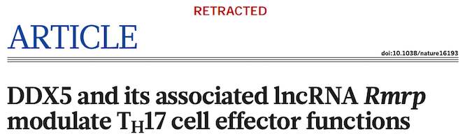
The publication contains an important finding on how a special type of RNA can affect T-cells, which could imply therapeutic effects and lead to new drugs for autoimmune diseases. But some of the co-authors were unable to replicate the published results and hence initiated a retraction. The retraction note states:
“In follow-up experiments to this article, we have been unable to replicate key aspects of the original results.”
For more information, see the commentary on Retraction Watch.
⇒ Replication may be an issue for other published research results, here the authors themselves discovered it. See below for some concerted efforts to study replicability of published scientific results.
Selfish reason number 5: reproducibility helps to build your reputation
“Generally, making your analyses available in this way will help you to build a reputation for being an honest and careful researcher. Should there ever be a problem with one of your papers, you will be in a very good position to defend yourself and to show that you reported everything in good faith.”
F Markowetz https://genomebiology.biomedcentral.com/articles/10.1186/s13059-015-0850-7
Issues with reproducibility/replication affect many fields
Is retraction due to error or non-feasibility of replication rare? Attempts at replication of results become more frequent. For example, in some fields there have been concerted efforts of aiming to replicate larger sets of studies allowing to assess reliability of results on a wider scale.
Biomedicine
F Prinz et al. attempted “To substantiate our incidental observations that published reports are frequently not reproducible with quantitative data, we performed an analysis of our early (target identification and validation) in-house projects in our strategic research fields of oncology, women’s health and cardiovascular diseases that were performed over the past 4 years.” From 67 studies only 22 were fully or partially confirmed, see https://www.nature.com/articles/nrd3439-c1.

Psychology
The Open Science Collaboration in Psychology “conducted replications of 100 experimental and correlational studies published in three psychology journals using high-powered designs and original materials when available.” in an attempt to “Estimating the reproducibility of psychological science”. Only 39 of 100 replication studies were significant and the mean effect size was about 50% compared to the original studies, see https://www.science.org/doi/10.1126/science.aac4716.

Economics
C Camerer et al. replicated “18 studies published in the American Economic Review and the Quarterly Journal of Economics between 2011 and 2014. All of these replications followed predefined analysis plans that were made publicly available beforehand, and they all have a statistical power of at least 90% to detect the original effect size at the 5% significance level.” They found significant effects in 11 of 18 studies with a mean effect size of about 66% compared to the original studies, see https://www.science.org/doi/10.1126/science.aaf0918.

Social Sciences
Again C Camerer et al. “replicate 21 systematically selected experimental studies in the social sciences published in Nature and Science between 2010 and 2015.” They found significant effects in 13 of 21 studies with mean effect size about 50% compared to the original studies, see https://www.nature.com/articles/s41562-018-0399-z.

Selfish reason number 1: reproducibility helps to avoid disaster
“This experience showed me two things. First of all, a project is more than a beautiful result. You need to record in detail how you got there. And second, starting to work reproducibly early on will save you time later. We wasted years of our and our collaborators’ time by not being able to reproduce our own results. All of this could have been avoided by keeping better track of how the data and analyses evolved over time.”
F Markowetz https://genomebiology.biomedcentral.com/articles/10.1186/s13059-015-0850-7
1,500 scientists lift the lid on reproducibility
In 2016 M Baker designed a survey meant to shed “light on the ‘crisis’ rocking research.” Here we discuss some of the results of the survey, for a complete report see https://www.nature.com/articles/533452a. The two graphs reproduced from raw data of the publication show that a large proportion of researchers believes that there are issues with reproducibility but that, again in the opinion of researchers, the extent of the problem differs between disciplines. Specifically, researchers from the “hard” sciences such as chemistry and physics, more frequently believe that the published work in their field is reproducible than for example in the “softer” sciences biology and medicine.
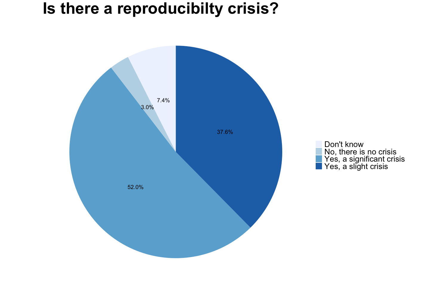
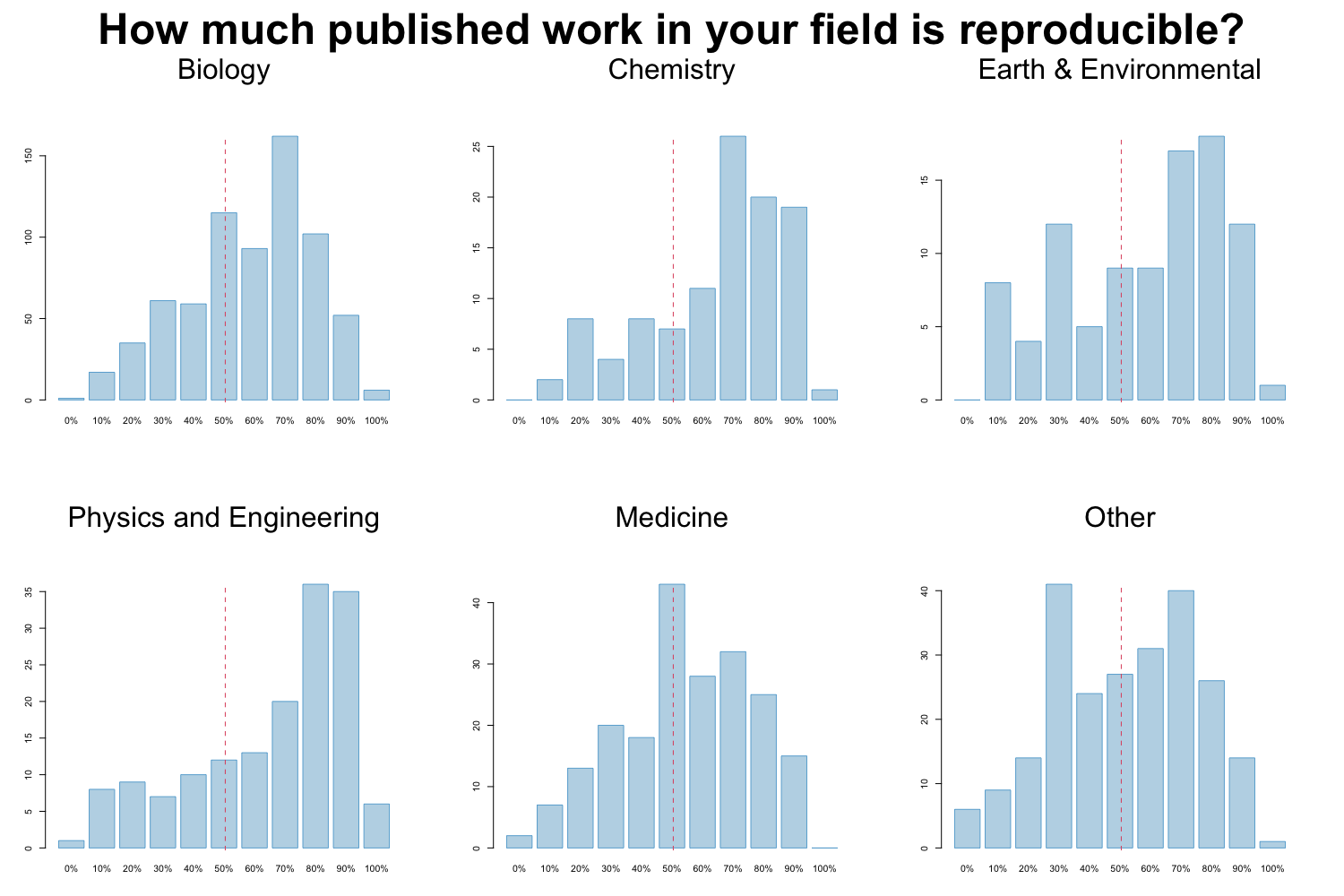
Image credit: Figures are reproduced from https://www.nature.com/articles/533452a with the data available on Figshare
Factors contributing to irreproducible research
Baker also tried to evaluate which factors could contribute to this perceived reproducibility issue. Most researchers (more than 95%) believe that selective reporting and pressure to publish always/often or sometimes contribute to irreproducibility. Still about 90% believe that low statistical power or poor analysis, not enough replication in the original lab and insufficient mentoring/oversight always/often or sometimes contribute. Around 80% agree with unavailability of methods/code, poor experimental design, unavailability of raw data and unsufficient peer review as contributing factors at least sometimes. Fraud plays a more minor role in the opinion of researchers.
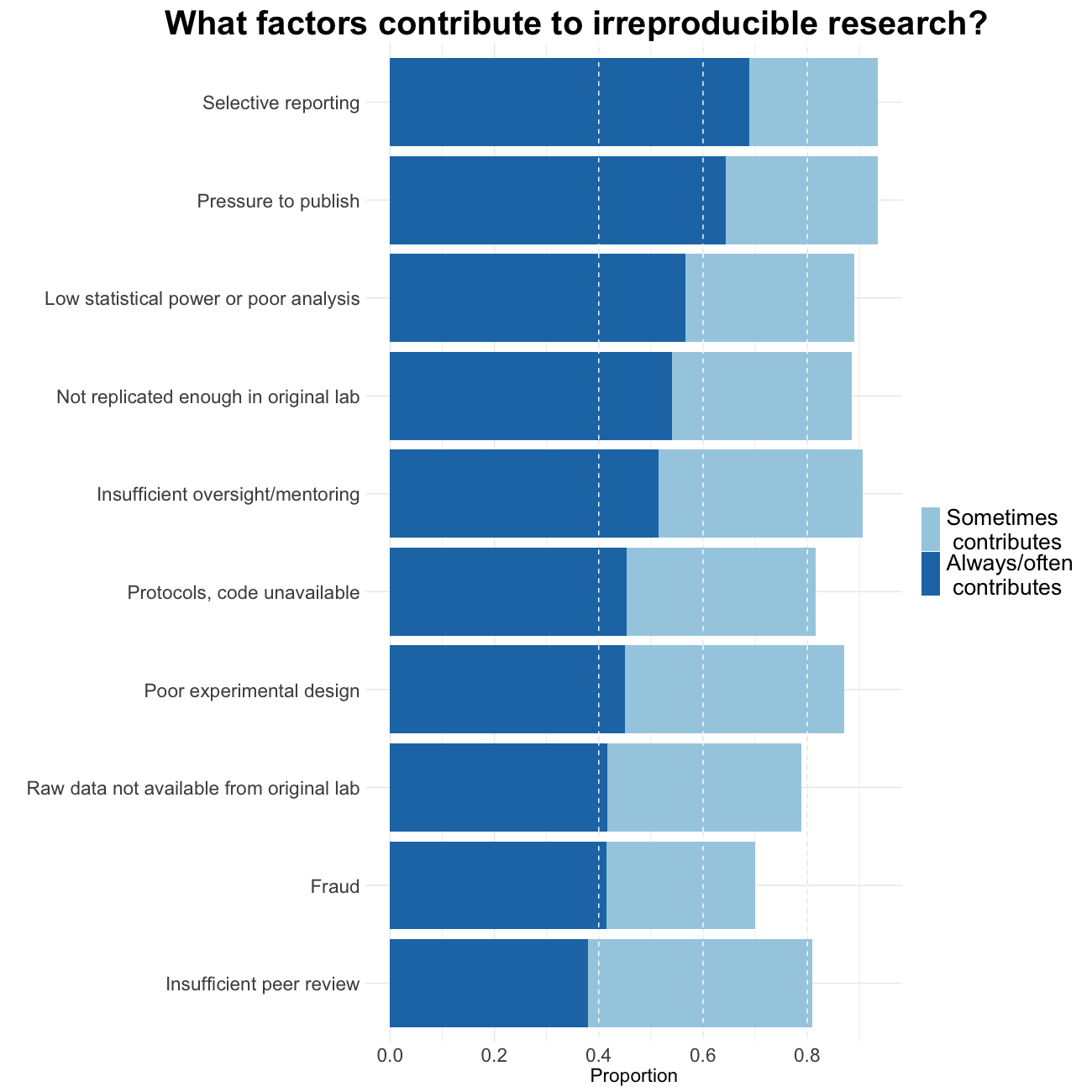
Image credit: Figures are reproduced from https://www.nature.com/articles/533452a with the data available on Figshare
Quiz on reproducibility/replicability
Effect size
Within the concerted replication efforts effect sizes of the replication attempts are on average (for one of them we do not have the information)
- smaller than the original effect
- approximately the same as the original effect
- bigger than the original effect
Solution
T smaller than the original effect
F approximately the same as the original effect F bigger than the original effect
Factors contributing to irreproducibility
Peeking at the content below, with which of the above factors that contribute to irreproducible research is the current episode of this course concerned?
Solution
Methods, code unavailable
2. Organization and software
In this section we learn about simple tools to avoid the fear in Markowetz’ selfish reason number 4.
Selfish reason number 4: reproducibility enables continuity of your work
“I did this analysis 6 months ago. Of course I can’t remember all the details after such a long time.”
F Markowetz https://genomebiology.biomedcentral.com/articles/10.1186/s13059-015-0850-7
Project organization
The main principles of data analytic project organization is the separation of
- data
- method
- output
and the preservation of the - computational environment
Project organization checklist
To achieve these principles make sure that you follow a procedure similar to:
- Put each project in its own directory named after the project.
- Put text associated documents in the
docdirectory.- Put raw data and metadata in a
datadirectory and files generated during cleanup and analysis in aresultsdirectory.- Put project source code in the
srcdirectory.- Put external scripts or compiled programs in the
bindirectory.- Name all files to reflect their content or function.
From Good enough practices in scientific computing by G Wilson et al. https://journals.plos.org/ploscompbiol/article?id=10.1371/journal.pcbi.1005510
In Packaging Data Analytical Work Reproducibly Using R (and Friends) B Marwick et al. https://www.tandfonline.com/doi/full/10.1080/00031305.2017.1375986 suggest a slightly different but conceptually similar approach. They propose to organize projects as so-called “research compendia”, for example like:
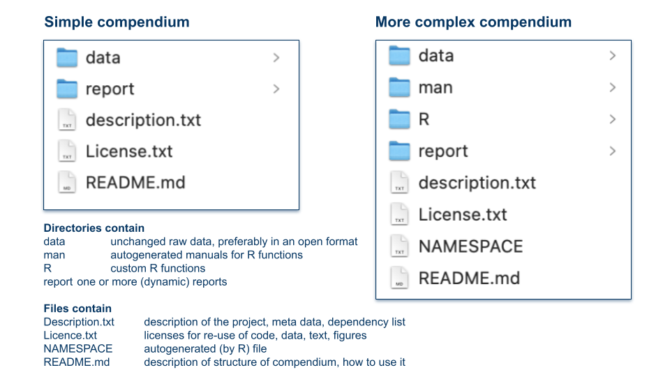
Image credit: Illustration of research compendia as suggested in B. Marwick et al. by Eva Furrer, CC-BY, https://doi.org/10.5281/zenodo.7994355.
Software/code
Writing code for a data analysis instead of using a GUI based tool makes an analysis to some degree reproducible (given the availability of the data and the analogous functioning of the computing environment). But code can also be a very detailed documentation of the employed methods, at least if it is written in a way such that it is understandable.
Selfish reason number 3: reproducibility helps reviewers see it your way
“One of the reviewers proposed a slight change to some analyses, and because he had access to the complete analysis, he could directly try out his ideas on our data and see how the results changed.”
F Markowetz https://genomebiology.biomedcentral.com/articles/10.1186/s13059-015-0850-7
Code understandability checklist
Use the following principles that make code easier to understand and use by others and your future self
- Place a brief explanatory comment at the start of every program.
- Decompose programs into functions.
- Be ruthless about eliminating duplication.
- Search for well-maintained libraries that do what you need.
- Test libraries before relying on them.
- Give functions and variables meaningful names.
- Make dependencies and requirements explicit.
- Do not comment and uncomment code sections to control behavior.
- Provide a simple example or test data set.
⇒ Your main goal with these principles is for your code to be readable, reusable, testable
From G Wilson et al. https://journals.plos.org/ploscompbiol/article?id=10.1371/journal.pcbi.1005510
On top of these high level recommendations writing and reading code is easier if one adheres to some styling rules. We have assembled our ten most important rules for code styling in R, these were influenced by https://style.tidyverse.org, https://google.github.io/styleguide/Rguide.html, https://cfss.uchicago.edu/notes/style-guide/ and by lot of experience in reading code by others and our past selves.
10 Rules for code styling (in R)
- Code styling is about readability not about correctness. The most important factor for readability is consistency which also increases writing efficiency.
- Use white space for readability, spaces around operators (e.g. +), after commas and before %>%, line breaks before each command and after each %>%.
- Control the length of your code lines to be about 80 characters. Short statements, even loops etc, can be a single line.
- Indent your code consistently, the preferred way of indentation are two spaces.
- Use concise and informative variable names, do not use spaces, link by underscore or use CamelCase. Avoid names, that are already used, e.g.,
mean,c.- Comment your code such that its structure is visible and findable (use code folding in RStudio).
- Do not use the equal sign for assignment in R, <- is the appropriate operator for this. Avoid right-hand assignment, ->, since it deteriorates readability.
- Curly braces are a crucial programming tool in R. The opening { should be the last character on the line, the closing } the first (and last) on the line.
- File naming is part of good programming style. Do not use spaces or non-standard characters, use consistent and informative names.
- Finally, do use the assistance provided by RStudio: command/control + i and shift + command/ctrl + A.
Quiz on organization and software
Duplication
Which of the following situations are meant by the principle “be ruthless about duplication”
- Copy-pasting code for several cases of the same type of calculation
- Several lines of code that are repeated at different locations in a larger script
- The duplication of statistical results with two approaches
- The same type of graph used for several cases
Solution
T Copy-pasting code for several cases of the same type of calculation
T Several lines of code that are repeated at different locations in a larger script
F The duplication of statistical results with two approaches
F The same type of graph used for several cases
Directories
Which directories would you use for cleaned data files of .csv format?
- results
- data
- doc
- results/cleaneddata
Solution
T results
F data
F doc
T results/cleaneddata
3. Data in spreadsheets
Selfish reason number 2: reproducibility makes it easier to write papers
“Transparency in your analysis makes writing papers much easier. For example, in a dynamic document (Box 1) all results automatically update when the data are changed. You can be confident your numbers, figures and tables are up-to-date. Additionally, transparent analyses are more engaging, more eyes can look over them and it is much easier to spot mistakes.”
F Markowetz https://genomebiology.biomedcentral.com/articles/10.1186/s13059-015-0850-7

Image credit: Randall Munroe/xkcd at https://xkcd.com/2180/ licensed as CC BY-NC.
Humor aside, spreadsheets have advantages and disadvantages, that can threaten reproducibility. But they are easy to use and so widespread that we better learn how to use them properly. And indeed data in spreadsheets can be organized in a way that favors reproducibility. We will summarize the recommendations of the article by K Broman and K Woo https://www.tandfonline.com/doi/full/10.1080/00031305.2017.1375989 into five checklists below. Broman and Woo promise that:
“By following this advice, researchers will create spreadsheets that are less error-prone, easier for computers to process, and easier to share with collaborators and the public. Spreadsheets that adhere to our recommendations will work well with the tidy tools and reproducible methods described elsewhere in this collection and will form the basis of a robust and reproducible analytic workflow.”
Spreadsheet consistency checklist
- Use consistent codes for categorical variables.
- Use a consistent fixed code for any missing values.
- Use consistent variable names.
- Use consistent subject identifiers.
- Use a consistent data layout in multiple files.
- Use consistent file names.
- Use a consistent format for all dates.
- Use consistent phrases in your notes.
- Be careful about extra spaces within cells.
Image credit: Image credit: copyright 2023, William F. Hertha under Creative Commons Attribution-NonCommercial-NoDerivatives 4.0 International License.
Choose good names for files and variables checklist
- No spaces
- Use underscores or hyphens or periods (only one of them)
- No special characters (&,*,%,ü,ä,ö,…)
- Use a unique, short but meaningful name
- Variable names have to start with a letter
- File names: include zero-padded version number, e.g. V013
- File names: include consistent date, e.g. YYYYMMDD
Be careful with dates checklist
- Use the ISO 8601 global standard
- Convention for dates in Excel is different on Windows and Mac computers
- Dates have an internal numerical representation
- Best to declare date columns as text, but only works prospectively
- Consider separate year, month, day columns
 Image credit: Randall Munroe/xkcd at https://xkcd.com/1179/ licensed as CC BY-NC.
Make your data truly readable and rectangular checklist
- Put one information of the same form per cell
- Do not add remarks in cells which should contain numerical values, e.g. >10000
- Include one variable per column, one row per subject: a rectangle of data
- Use the first and only the first row for variable names
- Do not calculate means, standard deviations etc in the last row
- Do not color, highlight or merge cells to codify information
- Use data validation at data entry
- Be careful with commas since they may be decimal separators
- Consider write protecting a file at the end of data collection
Code book/data dictionary checklist
- Create a code book in a separate sheet or file
Code book contains
- a short description
- unit and max/min values for continuous variables
- all levels with their code for categorical variables
- ordering for ordinal variables
- All variables have to be contained in the code book
Quiz on data in spreadsheets
Variable names
What are good names for the variable containing average height per age class?
- averageheightperageclass
- av_height_agecls
- height/class
- av_height
Solution
F averageheightperageclass
T av_height_agecls
F height/class
F av_height
Ruthlessness
Choose how to best initialize the variables that contain the BMI (body mass index) of 17 subjects at three different time points.
- bmi1 <- numeric(17); bmi2 <- numeric(17); bmi3 <- numeric(17)
- bmi <- matrix(0, nrow=17, ncol=3)
- bmi <- NULL; ind <- c(0,0,0); for (i in 1:17) bmi <- rbind(bmi, ind)
Solution
F bmi1 <- numeric(17); bmi2 <- numeric(17); bmi3 <- numeric(17)
T bmi <- matrix(0, nrow=17, ncol=3)
F bmi <- NULL; ind <- c(0,0,0); for (i in 1:17) bmi <- rbind(bmi, ind)
Special care for dates
This episode was created on February 28, 2023. Enter this date as an 8-digit integer:
Solution
20230228
Once more dates
This episode was created on February 28, 2023. Enter this date in ISO 8601 coding:
Solution
2023-02-28
Missing values
Choose all acceptable codes for missing values.
- 99999
- -99999
- NA
- ‘empty cell’
- non detectable
Solution
F 99999
F -99999
T NA
T ‘empty cell’
F non detectable
Code styling
The preferred way of indenting code is
- a tab
- none
- two spaces
Solution
F a tab
F none
T two spaces
Episode challenge
Improve a spreadsheet in Excel
Considering the input on data in spreadsheets try to improve the spreadsheet
This spreadsheet contains data from 482 patients, two columns with dates and 8 columns with counts of two different markers in the blood on a baseline date, on day 1, 2 and 3 of a certain therapy.
Specifically you should check
- the plausibility of all observations (e.g. value in correct range)
- the correct and consistent format of the entries, e.g. spelling or encoding errors
- date formats
- the format of missing values
- variable names
- the overall layout of the spreadsheet (header, merged cells, entries that are not observations etc.)
Solution
No solution provided here.
Improve a spreadsheet in R
We continue to work on the spreadsheet trainingdata.xlsx. This time we use
Rto correct the same errors in the spreadsheet. Why do you think is it better to use R for this process?
Solution
No solution provided here.
Key Points
Well organized projects are easier to reproduce
Consistency is the most important principle for coding analyses and for preparing data
Transparency increases reliability and trust and also helps my future self
Facilitating reproducibility in academic publications
Overview
Teaching: 90 min
Exercises: 60-90 minQuestions
How does academic publishing work?
What is the IMRAD format?
What are reporting guidelines and why are they useful for reproducibility?
How can we judge the quality and credibility of a preprint
Objectives
Understand how the academic publishing process works
Know about IMRAD sections and detect content in articles efficiently
Find appropriate reporting guidelines and know their advantages
Review a preprint using a simple checklist
1. Primer on academic publishing
Why publish?
Results of research are published in the literature such that
- findings get disseminated
- other researchers can assess “what is known”
- findings can get synthesized into overall evidence
- evidence can inform policy
but also such that
- researchers can document their output
- researchers can be assessed for career advancement
- researchers can build a “reputation”
⇒ Publication advances science and the career of scientists
Where to publish?
Most scientific publications are in academic journals or books. Journals may be
- discipline specific or across several disciplines
- run by learned societies or by commercial publishers
- open or closed access
- have more or less “impact”
- existing for over 100 years or only a short time
- exist in print/online or only online
- “predatory”
There may be more than 30’000 journals publishing 2’000’000 articles, aka papers, per year.
How does the process of publication in journals work?
Authors have to follow several steps, which are in general:
- Carry out a study or another type of research project, write an article, select a journal
- Submit the article to peer review at the journal
- The article will be assigned an editor and undergoes formal checks
- The editor decides if it will be peer-reviewed or rejected directly (desk-rejection)
- The editor searches peer reviewers, usually at least two independent and anonymous experts
- The article is peer-reviewed resulting in review reports
- The editor assesses the reports and makes a decision among:
- Rejection: the article cannot be published at this journal
- Revision: the article has to undergo changes, sometimes major, before publication
- Acceptance: the article can be published as it is, most often conditional on small cosmetic changes
The below image illustrates this process:
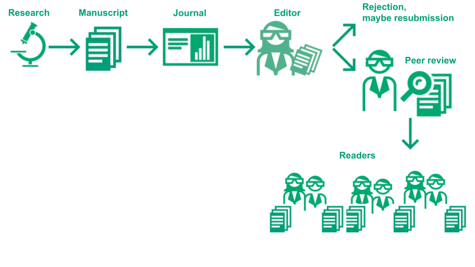
Image Credit: (Part of) Illustration of the academic publication process by the Center for Reproducible Science (E. Furrer), CC-BY, https://doi.org/10.5281/zenodo.7994313.
What is a doi and what is Crossref?
Since the goal of scientific articles is to contribute to the advancement of science they need to be findable and identifiable for future work. For that a necessary condition is that they have a unique identifier, which is nowadays, of course, a digital identifier.
From Wikipedia:
“A digital object identifier (DOI) is a persistent identifier or handle used to identify objects uniquely, standardized by the International Organization for Standardization (ISO). An implementation of the Handle System, DOIs are in wide use mainly to identify academic, professional, and government information, such as journal articles, research reports, data sets, and official publications. DOIs have also been used, however, to identify other types of information resources, such as commercial videos.”
Since a DOI is a unique identifier you can find any article by concatenating https://doi.org/ and the DOI of the article and pasting it in the URL field of your browser. Try it out with 10.1186/s13059-015-0850-7. DOIs are issued by, for example, Crossref:
“Crossref (formerly styled CrossRef) is an official digital object identifier (DOI) Registration Agency of the International DOI Foundation. It is run by the Publishers International Linking Association Inc. (PILA) and was launched in early 2000 as a cooperative effort among publishers to enable persistent cross-publisher citation linking in online academic journals.”
Hence Crossref is the organisation which registers most doi for academic publications. (Source Wikipedia)
Indexing of journals/publications
Indexation of a journal, i.e. the inclusion of its articles in a meta data base, is considered a reflection of the quality of the journal. Indexed journals may be of higher scientific quality as compared to non-indexed journals. Examples of indexes are:
- Pubmed/MEDLINE https://pubmed.ncbi.nlm.nih.gov/
- Directory of Open Access Journals https://doaj.org/
- Thomson Reuters Journal Citation Reports https://clarivate.com/webofsciencegroup/solutions/journal-citation-reports
Many universities also have in-house databases for the articles produced by their researchers: at the University of Zurich, for example, this is ZORA https://www.zora.uzh.ch/
Why is peer review part of the publication process?
- Peer review allows to check and improve research.
- Peer review serves as scientific quality control.
- Peer review provides a form of self regulation for science.
- Peer review makes publication (more) trustworthy
Before you review for the first time see Open Reviewer Toolkit
Known issues of the process
Issues with peer review
- Anonymity of peer reviewers but not authors
- Conflict of interest of peer reviewers: plagiarism, delays, favouritism, biases
- Peer reviewers may not be competent enough
- Peer reviewers are volunteers and almost not rewarded
- The process is slow and unpredictable
- Increasing numbers of publications make it more and more unfeasible
Issues with the publication system
- Sensational results are privileged over solid but less sensational research
- Lacking equity, e.g. already published authors are given cumulatively more credit (Matthew effect)
- Expensive either in subscription fees in order to be able read a journal or processing charges to publish open to everyone
- Evaluation of researchers is publication based and this incentivises fast but not rigorous research (“publish or perish”)
Preprints
Preprints are a relatively new form of publication which helps to overcome some of the issues with peer review and with the publication system. See the extension of the above graphic including preprints in the publication process:
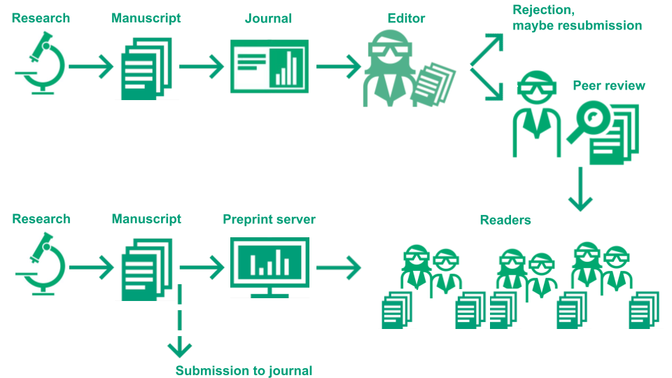 Image Credit: Illustration of the academic publication process by Eva Furrer, CC-BY, https://doi.org/10.5281/zenodo.7994313.
See also J Berg et al. for a comment on the introduction of preprints in Biology: https://www.science.org/doi/abs/10.1126/science.aaf9133.
Quiz on academic publishing
Peer review
Which statements are correct for the practice of peer review in academic publishing?
- peer review contributes to keep the quality of publications to high standard
- peer reviewers are financially rewarded for their contribution
- peer review may take a long time and its outcome does not always depend on the quality of a publication
- peer reviewers are always objective experts not pursuing their personal interest
- one publication is always peer reviewed by exactly one expert
Solution
T peer review contributes to keep the quality of publications to high standard
F peer reviewers are financially rewarded for their contribution
T peer review may take a long time and its outcome does not always depend on the quality of a publication
F peer reviewers are always objective experts not pursuing their personal interest
F one publication is always peer reviewed by exactly one expert
Unfairness
The publication system is unfair since authors from prestigious institutions or authors with already a lot of publication are privileged, for them it is easier to publish since editors and reviewers decide in their favor more often. Such a type of effect is not unique to academic publishing but occurs in different aspects of society.
A common name for this effect is:
Solution
Matthew effect
Preprints
Why do preprints help to overcome some of the issues with peer review and with the publication system?
Solution
Preprints avoid conflicts of interests of peer reviewers, allow certain and fast publication and are completely free of charge.
2. What is the IMRAD format?
What is IMRAD?
The acronym IMRAD stands for “Introduction, Methods, Results and Discussion”. IMRAD is a widespread format in the biomedical, natural and social science research literature for reports on empirical studies. It is a convenience to readers because they can easily find the specific information they may be looking for in an article. See the article of J Wu https://link.springer.com/article/10.1007/s10980-011-9674-3 for a quick overview illustration:
 Image credit: Illustration of the IMRAD concept, by Eva Furrer, CC-BY, https://doi.org/10.5281/zenodo.7994280.
R Day writes about the history of scientific publication in his article, “The Origins of the Scientific Paper: The IMRAD Format”. He specifically mentions the scientific method and its cornerstone the principle of reproducibility of results. The IMRAD Format has been introduced in order to represent the steps of the scientific method.
“Eventually, in 1972, the IMRAD format became “standard” with the publication of the American National Standard for the preparation of scientific papers for written or oral presentation.”
R Day American Medical Writers Association, 1989, Vol 4, No 2., 16–18. This article is not easily obtainable online, potentially your library can obtain it for you. If this is not possible, please contact the authors of this lesson.
What is the scientific method?
The Center for Reproducible Science at the University of Zurich uses a simplified graphical representation of the scientific method in its communications:
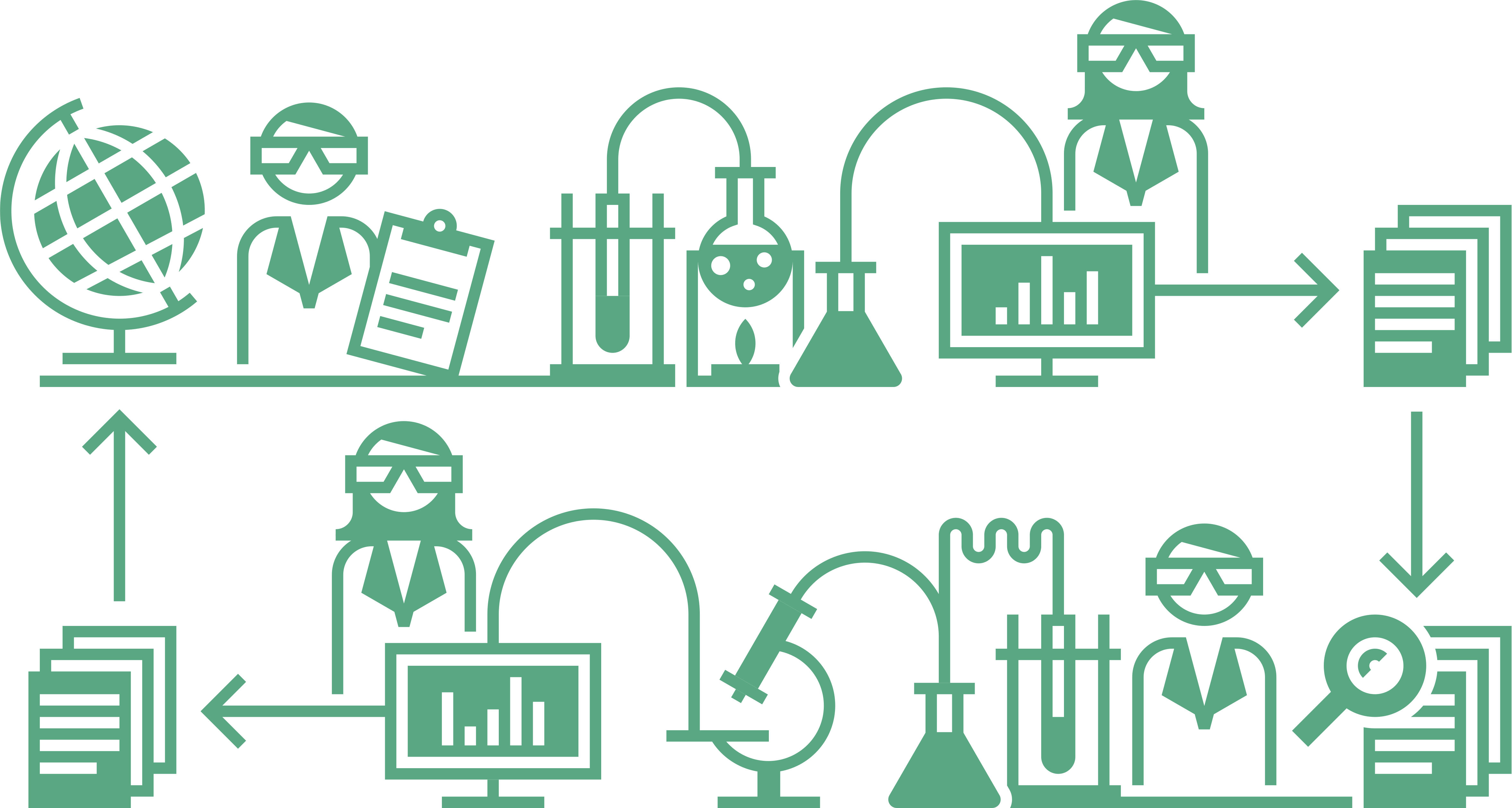 Image credit: Illustrations of meta research and the research cycle by Luca Eusebio and Eva Furrer, CC-BY, https://doi.org/10.5281/zenodo.7994222.
“What is the Scientific Method?” is a philosophical question that we can not answer in full detail here and it may be one of the questions to which there is no single correct answer. We will use the Stanford Encyclopedia of Philosophy definition as a first approximation:
“Often, ‘the scientific method’ is presented in textbooks and educational web pages as a fixed four or five step procedure starting from observations and description of a phenomenon and progressing over formulation of a hypothesis which explains the phenomenon, designing and conducting experiments to test the hypothesis, analyzing the results, and ending with drawing a conclusion.”
https://plato.stanford.edu/entries/scientific-method/
This view coincides with a common approach to empirical research, even if it may be an oversimplification and a strong generalization, we assume an underlying scientific process for this lesson that is close to such an approach.
What should the IMRAD sections contain?
In 1997 the International Committee of Medical Journal Editors published “Uniform Requirements” on the structure of articles:
“The text of observational and experimental articles is usually (but not necessarily) divided into sections with the headings Introduction, Methods, Results, and Discussion. Long articles may need subheadings within some sections (especially the Results and Discussion sections) to clarify their content. Other types of articles, such as case reports, reviews, and editorials, are likely to need other formats. Authors should consult individual journals for further guidance.”
The Uniform Requirements have been updated in December 2021 and the most current version can be found here: http://www.icmje.org/about-icmje/faqs/icmje-recommendations/ The 1997 version of the requirements is avaliable here: https://www.icmje.org/recommendations/archives/1997_urm.pdf.
The document contains much more than advice on structuring a manuscript, e.g. authorship roles, peer review roles etc. Please read the chapter/section “Manuscript Sections” in one of the two versions in order to get an overview of the expected content of the IMRAD sections.
There is a long list of journals that state that they follow these requirements http://www.icmje.org/journals-following-the-icmje-recommendations/
Quiz on IMRAD
Cornerstone of the scientific method
Hippocrates is credited as the discoverer of the scientific method. But he did not clearly state its cornerstone. The cornerstone of the scientific method is the:
Solution
reproducibility of results
Introduction section
The introduction section in an article following the IMRAD structure should contain?
- a short overview over the data and main conclusions of the article
- the purpose/objective of the presented research
- a complete and detailed background of the wider research area
Solution
F a short overview over the data and main conclusions of the article
T the purpose/objective of the presented research
F a complete and detailed background of the wider research area
Methods section
The methods section in an article following the IMRAD structure should contain
- a descriptive analysis of the collected data such that appropriate methods can be chosen for the analysis
- enough information such that a reader would in theory be able to reproduce the results
- only information that was available before data collection
Solution
F a descriptive analysis of the collected data such that appropriate methods can be chosen for the analysis
T enough information such that a reader would in theory be able to reproduce the results
T only information that was available before data collection
Statistical methods
The statistical methods subsection of the methods section in an article following the IMRAD structure should contain
- detailed information software and packages
- only contain p-values an no effect sizes or estimates of the precision
- distinguish pre-specified parts of the analysis from parts that have been done in an explorative way after looking at the collected data
Solution
T detailed information software and packages
F only contain p-values an no effect sizes or estimates of the precision
T distinguish pre-specified parts of the analysis from parts that have been done in an explorative way after looking at the collected data
Discussion section
The discussion section in an article following the IMRAD structure should contain
- limitations of the study
- those conclusions in view of the goals of the study that are supported by the results
- a detailed summary of all results
Solution
T limitations of the study
T those conclusions in view of the goals of the study that are supported by the results
F a detailed summary of all results
3. Reporting guidelines
Reporting guidelines are checklists that are based on wide agreement in a field providing more detailed guidance on the contents of IMRAD section.
Goals of reporting guidelines
The goals of Reporting Guidelines are summarized in I Simera and D Altman https://onlinelibrary.wiley.com/doi/full/10.1111/ijcp.12168. They summarize some key principles for responsible reserach reporting:
“Researchers should present their results clearly, honestly, and without fabrication, falsification or inappropriate data manipulation.”
“Researchers should strive to describe their methods clearly and unambiguously so that their findings can be confirmed by others.”
“Researchers should follow applicable reporting guidelines. Publications should provide sufficient detail to permit experiments to be repeated by other researchers.”
Good reporting is an ethical imperative
The WMA Declaration of Helsinki – Ethical Principles for Medical Research Involving Human Subjects states:
“Researchers, authors, sponsors, editors and publishers all have ethical obligations with regard to the publication and dissemination of the results of research. Researchers have a duty to make publicly available the results of their research on human subjects and are accountable for the completeness and accuracy of their reports. All parties should adhere to accepted guidelines for ethical reporting. Negative and inconclusive as well as positive results must be published or otherwise made publicly available. […]”
Good reporting is required by many journals
For example the Reporting requirements of the Nature Research journals aim to improve the transparency of reporting and reproducibility of published results across all areas of science. Before peer review, the corresponding author must complete an editorial policy checklist to ensure compliance with Nature Research editorial policies; where relevant, manuscripts sent for review must include completed reporting summary documents.
Nature portfolio Reporting Summary https://www.nature.com/documents/nr-reporting-summary-flat.pdf Nature Reporting requirements and reproducibility editorials https://www.nature.com/nature-portfolio/editorial-policies/reporting-standards#editorials
Database of reporting guidelines
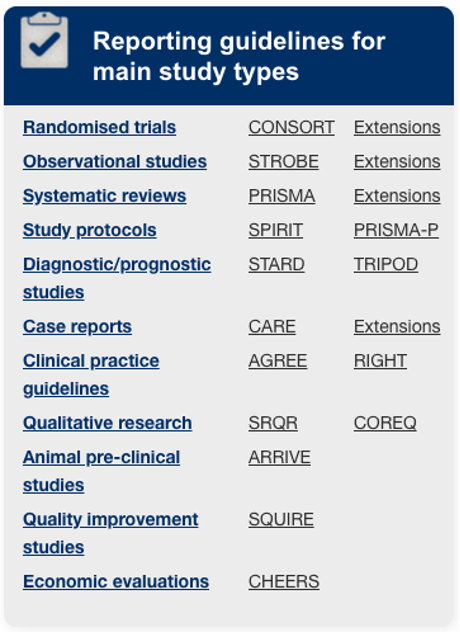
“The EQUATOR (Enhancing the QUAlity and Transparency Of health Research) Network is an international initiative that seeks to improve the reliability and value of published health research literature by promoting transparent and accurate reporting and wider use of robust reporting guidelines.”
“It is the first coordinated attempt to tackle the problems of inadequate reporting systematically and on a global scale; it advances the work done by individual groups over the last 15 years.”
http://www.equator-network.org/reporting-guidelines/
The MDAR framework

“We were motivated to develop the MDAR Framework as part of our own and others’ attempts to improve reporting to drive research improvement and ultimately greater trust in science. Existing tools, such as the ARRIVE guidelines, guidance from FAIRSharing, and the EQUATOR Network, speak to important sub-elements of biomedical research. This new MDAR Framework aims to be more general and less deep, and therefore complements these important specialist guidelines.”
M McLeod et al. https://www.pnas.org/content/118/17/e2103238118
Other examples of reporting guidelines
M Michel et al. http://dmd.aspetjournals.org/content/dmd/48/1/64.full.pdf
T Hartung et al.https://www.altex.org/index.php/altex/article/view/1229
S Cruz Rivera et al. https://www.nature.com/articles/s41591-020-1037-7.pdf
M Appelbaum https://psycnet.apa.org/fulltext/2018-00750-002.html
⇒ also available for qualitative and mixed methods
R Poldrack et al. https://www.sciencedirect.com/science/article/pii/S1053811907011020?via%3Dihub

L Riek https://dl.acm.org/doi/pdf/10.5898/JHRI.1.1.Riek
Benefits of reporting guidelines
Benefits for researchers
Guidelines helps at protocol stage, e.g. with examples how to reduce the risk of bias
Useful reminder of all necessary details at writing stage, especially for junior researchers
Appropriate reporting allows the replication or inclusion in meta research projects
Adherence increases chances of article acceptance at journals
Benefits for peer reviewers
Peer review is an important step but limited guidance is available
Key issues and methods that should be covered in an article can be found in reporting guideline
If journal requests a completed checklist approach even easier
Criticism can be justified by pointing to reporting guideline (or their explanation documents)
But not a guarantee for a high quality study
Example: reporting of methods
“t-tests were used for comparisons of continuous variables and Fisher’s Exact test or Chi-squared test (where appropriate) were used for comparisons of binary variables”
versus
“The primary outcome, time to […], was analysed using a two-sample Wilcoxon rank-sum test. The secondary outcomes of […] were analysed using the Chi square and Fisher’s exact test, respectively, and the secondary outcome of time to […] was analysed using a two- sample Wilcoxon rank-sum test. All analyses were carried out on a per protocol basis using [software version]”
courtesy of M. Schussel of the Equator Network
Quiz on reporting guidelines
Reporting guidelines
Reporting guidelines are
- only used in biomedicine
- based on a wide consensus of experts
- mainly useful for the reader
Solution
F only used in biomedicine
T based on a wide consensus of experts
F mainly useful for the reader
JARS quiz 1
Look at the Journal Article Reporting Standards for Quantitative Research in Psychology: The APA Publications and Communications Board Task Force Report (JARS)
M Appelbaum et al. https://doi.apa.org/fulltext/2018-00750-002.htmlThe guideline suggests to to group all hypotheses, analyses, and conclusions into
- significant and non-significant
- primary, secondary, and exploratory
- novel, derived, and replication
Solution
F significant and non-significant
T primary, secondary, and exploratory
F novel, derived, and replication
JARS quiz 2
Look at the Journal Article Reporting Standards for Quantitative Research in Psychology: The APA Publications and Communications Board Task Force Report (JARS)
M Appelbaum et al. https://doi.apa.org/fulltext/2018-00750-002.htmlFor publications that report on new data collections regardless of research design the guideline includes information on:
- where to report on registration of the underlying study
- where to report on the availabililty of data
- where to report a manual of procedures allowing replication
Solution
T where to report on registration of the underlying study: mainly for clinical trials
T where to report on the availabililty of data: specifically only for meta analysis
T where to report a manual of procedures allowing replication: specifically for experimental studies
JARS quiz 3
Look at the Journal Article Reporting Standards for Quantitative Research in Psychology: The APA Publications and Communications Board Task Force Report (JARS)
M Appelbaum et al. https://doi.apa.org/fulltext/2018-00750-002.htmlIn the data diagnostics and analytic strategy sections the guideline suggest that information on the following be reported
- in which case to exclude the data of participants from the study at the analysis stage
- how to deal with missing data
- which precise inferential statistics procedure to use
Solution
T in which case to exclude the data of participants from the study at the analysis stage
T how to deal with missing data
F which precise inferential statistics procedure to use: the guideline mentions a strategy, i.e. not a single procedure; it also suggests that this is to be specified for each type of hypothesis
4. Quality and credibility of a preprint: the Precheck checklist
What is Markdown and why do we learn about it?
Markdown is a lightweight markup language for creating formatted text using a plain-text editor. The goal is an easy to write and and easy to read format, even as raw code. It is traditionally used for so-called readme files in software development and extensively as a tool to produce html code for websites. There are several flavors of the language that are used in different places but the basics are the same almost anywhere.
Since a file containing Markdown text only contains plain text and no binary information, it is a lightweight format. Moreover, changes in Markdown files are particularly easy to track.
For a reference sheet of the syntax, please see here: https://www.markdownguide.org/cheat-sheet/
We introduce Markdown here because it will be used in the following episodes of this course and we start to practice it while learning about and using the PRECHECK checklist.
Markdown
Use the online Markdown editor Dillinger to create your first Markdown document including a title, two numbered sections one containg an itemized list and the other a numbered list. Do also include bold and italics font. You can use whatever text you like if nothing else comes to mind you may simple use lorem ipsum
Solution
No solution provided here.
Introduction to PRECHECK
As we have already seen preprints are manuscripts describing scientific studies that have not been peer-reviewed, that is, checked for quality by an unbiased group of scientists in the same field.
Preprints are typically posted online on preprint servers (e.g. BioRxiv, MedRxiv, PsyRxiv) instead of scientific journals. Anyone can access and read preprints freely, but because they are not verified by the scientific community, they can be of lower quality, risking the spread of misinformation. When the COVID-19 pandemic started, a lack of understanding of preprints has led to low-quality research gaining popularity and even infiltrating public policy.
Inspired by such events, PRECHECK was created: a checklist to help assess the quality of preprints in psychology and medicine, and judge their credibility. This checklist was created with scientifically literate non-specialists in mind, such as students of medicine and psychology, and science journalists. The contents of PRECHECK are reproduced here with permission.
The checklist contains 4 items, see below or on the linked website. When using PRECHECK on a preprint read each item and the Why is this important? Section underneath each of them. Check if the preprint you are reading fulfills the item’s criteria - if yes, write down a yes for this item. In doing so use your knowledge of the IMRAD structure and smart searching on the website or the pdf.
Generally, the more “yes” on the checklist your preprint gets, the higher its quality, but this is only a superficial level of assessment. For a thorough, discriminative analysis of a preprint, you also need to consult the related Let’s dig deeper Sections underneath most items. When using the checklist, it is recommended that you have both the preprint itself as a pdf, and the webpage on the preprint server where the preprint was posted at hand. You can also check online whether the preprint has already been peer reviewed and published in a journal.
The checklist works best for studies with human subjects, using primary data (that the researchers collected themselves) or systematic reviews, meta-analyses and re-analyses of primary data. It is not ideally suited to simulation studies (where the data are computer-generated). In general, if the study sounds controversial, improbable, or too good to be true, we advise you to proceed with caution when reading the study and being especially critical.
The PRECHECK checklist
Below you find the checklist together with Why is this important? and Let’s dig deeper Sections. It can also be directly accessed in the Markdown PRECHECK checklist (without the Why is this important? Sections).
1. Research question
Is the research question/aim stated?
Why is this important?
A study cannot be done without a research question/aim. A clear and precise research question/aim is necessary for all later decisions on the design of the study. The research question/aim should ideally be part of the abstract and explained in more detail at the end of the introduction.
2. Study type
Is the study type mentioned in the title, abstract, introduction, or methods?
Why is this important?
For a study to be done well and to provide credible results, it has to be planned properly from the start, which includes deciding on the type of study that is best suited to address the research question/aim. There are various types of study (e.g., observational studies, randomised experiments, case studies, etc.), and knowing what type a study was can help to evaluate whether the study was good or not.
What is the study type?
Some common examples include:
observational studies - studies where the experimental conditions are not manipulated by the researcher and the data are collected as they become available. For example, surveying a large group of people about their symptoms is observational. So is collecting nasal swabs from all patients in a ward, without having allocated them to different pre-designed treatment groups. Analysing data from registries or records is also observational. For more information on what to look for in a preprint on a study of this type, please consult the relevant reporting guidelines: STROBE.
randomised experiments - studies where participants are randomly allocated to different pre-designed experimental conditions (these include Randomised controlled trials [RCTs]). For example, to test the effectiveness of a drug, patients in a ward can be randomly allocated to a group that receives the drug in question, and a group that receives standard treatment, and then followed up for signs of improvement. For more information on what to look for in a preprint on a study of this type, please consult the relevant reporting guidelines: CONSORT.
case studies - studies that report data from a single patient or a single group of patients. For more information on what to look for in a preprint on a study of this type, please consult the relevant reporting guidelines: CARE.
systematic reviews and meta-analyses - summaries of the findings of already existing, independent studies. For more information on what to look for in a preprint on a study of this type, please consult the relevant reporting guidelines: PRISMA.
Let’s dig deeper
If the study type is not explicitly stated, check whether you can identify the study type after reading the paper. Use the question below for guidance:
- Does the study pool the results from multiple previous studies? If yes, it falls in the category systematic review/meta-analysis.
- Does the study compare two or more experimenter-generated conditions or interventions in a randomised manner? If yes, it is a randomised experiment.
- Does the study explore the relationship between characteristics that were not experimenter-generated? If yes, then it is an observational study
- Does the study document one or multiple clinical cases? If yes, it is a case study.
3. Transparency
a. Is a protocol, study plan, or registration of the study at hand mentioned?
b. Is data sharing mentioned? Mentioning any reasons against sharing also counts as a ‘yes’. Mentioning only that data will be shared “upon request” counts as a ‘no’.
c. Is materials sharing mentioned? Mentioning any reasons against sharing also counts as a ‘yes’. Mentioning only that materials will be shared “upon request” counts as a ‘no’.
d. Does the article contain an ethics approval statement (e.g., approval granted by institution, or no approval required)?
e. Have conflicts of interest been declared? Declaring that there were none also counts.
Why is this important?
Study protocols, plans, and registrations serve to define a study’s research question, sample, and data collection method. They are usually written before the study is conducted, thus preventing researchers from changing their hypotheses based on their results, which adds credibility. Some study types, like RCT’s, must be registered.
Sharing data and materials is good scientific practice which allows people to review what was done in the study, and to try to reproduce the results. Materials refer to the tools used to conduct the study, such as code, chemicals, tests, surveys, statistical software, etc. Sometimes, authors may state that data will be “available upon request”, or during review, but that does not guarantee that they will actually share the data when asked, or after the preprint is published.
Before studies are conducted, they must get approval from an ethical review board, which ensures that no harm will come to the study participants and that their rights will not be infringed. Studies that use previously collected data do not normally need ethical approval. Ethical approval statements are normally found in the methods section.
Researchers have to declare any conflicts of interest that may have biased the way they conducted their study. For example, the research was perhaps funded by a company that produces the treatment of interest, or the researcher has received payments from that company for consultancy work. If a conflict of interest has not been declared, or if a lack of conflict of interest was declared, but a researcher’s affiliation matches with an intervention used in the study (e.g., the company that produces the drug that is found to be the most effective), that could indicate a potential conflict of interest, and a possible bias in the results. A careful check of the affiliation of the researchers can help identify potential conflicts of interest or other inconsistencies. Conflicts of interests should be declared in a dedicated section along with the contributions of each author to the paper.
Let’s dig deeper
a. Can you access the protocol/study plan (e.g., via number or hyperlink)
b. Can you access at least part of the data (e.g., via hyperlink, or on the preprint server). Not applicable in case of a valid reason for not sharing.
c. Can you access at least part of the materials (e.g., via hyperlink, or on the preprint server). Not applicable in case of a valid reason for not sharing.
d. Can the ethical approval be verified (e.g., by number). Not applicable if it is clear that no approval was needed.
By ‘access’, we mean whether you can look up and see the actual protocol, data, materials, and ethical approval. If you can, you can also look into whether it matches what is reported in the preprint.
4. Limitations
Are the limitations of the study addressed in the discussion/conclusion section?
Why is this important?
No research study is perfect, and it is important that researchers are transparent about the limitations of their own work. For example, many study designs cannot provide causal evidence, and some inadvertent biases in the design can skew results. Other studies are based on more or less plausible assumptions. Such issues should be discussed either in the Discussion, or even in a dedicated Limitations section.
Let’s dig deeper
Check for potential biases yourself. Here are some examples of potential sources of bias.
Check the study’s sample (methods section). Do the participants represent the target population? Testing a drug only on white male British smokers over 50 is probably not going to yield useful results for everyone living in the UK, for example. How many participants were there? There is no one-size-fits-all number of participants that makes a study good, but in general, the more participants, the stronger the evidence.
Was there a control group or control condition (e.g., placebo group or non-intervention condition)? If not, was there a reason? Having a control group helps to determine whether the treatment under investigation truly has an effect on an experimental group and reduces the possibility of making an erroneous conclusion. Not every study can have such controls though. Observational studies, for example, typically do not have a control group or condition, nor do case studies or reviews. If your preprint is on an observational study, case study, or review, this item may not apply.
Was there randomisation? That is, was the allocation of participants or groups of participants to experimental conditions done in a random way? If not, was there a reason? Randomisation is an excellent way to ensure that differences between treatment groups are due to treatment and not confounded by other factors. For example, if different treatments are given to patients based on their disease severity, and not at random, then the results could be due to either treatment effects or disease severity effects, or an interaction - we cannot know. However, some studies, like observational studies, case studies, or reviews, do not require randomisation. If your preprint is on an observational study, case study, or review, this item may not apply.
Was there blinding? Blinding means that some or all people involved in the study did not know how participants were assigned to experimental conditions. For example, if participants in a study do not know whether they are being administered a drug or a sham medication, the researchers can control for the placebo effect (people feeling better even after fake medication because of their expectation to get better). However, blinding is not always possible and cannot be applied in observational studies or reanalyses of existing non-blinded data, for example. If your preprint is on an observational study, case study, or review, this item may not apply).
Episode challenge
Use PRECHECK for two preprints
Question 1
Select two preprints in psychology and/or medicine that include human subjects. At least one of them should correspond to a preregistration. Review them using the checklist directly in the Markdown file. Create one Markdown file for the assessment of both preprints by copy pasting. Add clear sections for each preprint using Markdown syntax.
Answer at least all yes/no question for each preprint, add an explanation for your choice of answer.
Note: Use your knowledge of the IMRAD structure for smart searching in the articles, the idea is not that you read both articles in detail. Use a search strategy within the pdfs with appropriate terms. Do also look on the preprint servers, they do sometimes contain information that is not directly in the article (e.g. regarding data sharing).
Question 2
Find the preregistration(s) of the preprint and compare.
Question 3
Find the pubilication(s) of the preprint and compare.
Question 4
Look at the preprint server that has been used: what do you find on reporting guidelines? Which reporting guideline would be pertinent for this article? Do you find something on reporting guidelines in the published article? Do you find the policy of the journal regarding reporting guidelines?
Question 5
Find the journal policy on data sharing and comment.
Solution
No solution provided here.
Key Points
The structure of an article represents the steps of the scientific method
The structure of an article helps in finding information and to get started with reproduction/replication
There are some simple questions that can be asked when judging the quality of an article
Collaboration drives Open Science and is a challenge for reproducibility
Overview
Teaching: 45 min
Exercises: 60 minQuestions
Why is collaborative work especially important for Open and Reproducible Science?
What are tools that faciliate collaborative work?
Objectives
Learn about Open Science at CERN
Get to know OSF as one tool
Learn about version control systems
1. Use case: Open Science at CERN
The world wide web was invented at CERN and its leadership was visionary in making sure that the technology would be licensed under an open-source framework “with the explicit goal of preventing private companies from turning it into proprietary software”
CERN and the particle physics community are trailblazers of the Open Science movement.
We aim to look at CERN’s approach to Open Science by reading three articles that appeared in the CERN Courier in 2019, see excerpts below and use the links to read the full articles.
Open science: a vision for collaborative, reproducible and reusable research
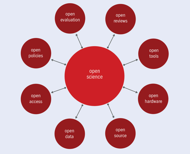 Image Credit: T.Simko.
“True open science demands more than simply making data available: it needs to concern itself with providing information on how to repeat or verify an analysis performed over given datasets, producing results that can be reused by others for comparison, confirmation or simply for deeper understanding and inspiration. This requires runnable examples of how the research was performed, accompanied by software, documentation, runnable scripts, notebooks, workflows and compute environments. It is often too late to try to document research in such detail once it has been published.”
S Dallmeier-Tiessen and T Simko https://cerncourier.com/a/open-science-a-vision-for-collaborative-reproducible-and-reusable-research/
Inspired by software
 Image Credit: S Kulkarni.
"”The underlying ideal is open collaboration: peers freely, collectively and publicly build software solutions. A second ideal is recognition, in which credit for the contributions made by individuals and organisations worldwide is openly acknowledged. A third ideal concerns rights, specifically the so-called four freedoms granted to users: to use the software for any purpose; to study the source code to understand how it works; to share and redistribute the software; and to improve the software and share the improvements with the community. Users and developers therefore contribute to a virtuous circle in which software is continuously improved and shared towards a common good, minimising vendor lock-in for users.”
G Tenaglia and T Smith https://cerncourier.com/a/inspired-by-software/
Preserving the legacy of particle physics
 Image Credit: https://cerncourier.com/a/preserving-the-legacy-of-particle-physics/ with original CC-By in Phys. Lett. B 716 30.
“CMS aims to release half of each year’s level-three data three years after data taking, and 100% of the data within a ten-year window. By guaranteeing that people outside CMS can use these data, says Lassila-Perini, the collaboration can ensure that the knowledge of how to analyse the data is not lost, while allowing people outside CMS to look for things the collaboration might not have time for. To allow external re-use of the data, CMS released appropriate metadata as well as analysis examples.”
A Rao https://cerncourier.com/a/preserving-the-legacy-of-particle-physics/.
More information can be found in the article “Open is not enough” by X Chen et al. https://www.nature.com/articles/s41567-018-0342-2.
Open Science is about collaboration
Collaborative research becomes more and more important since complex challenges require a diverse team science approach, e.g. particle physics, drug development, big data projects in medicine or social science etc.
Collaborative research entails specific practical issues that may affect reproducibility when different versions of files are worked on by several collaborators.
Collaborative tools can be used to make research accessible to the public beyond publications, e.g. protocols, code, data.
Quiz on open science at CERN
Reana
CERN’s REANA can be used to
- publish finished analysis results
- submit parameterised computational workflows to run on remote compute clouds
- reinterpret preserved analyses
- run “active” analyses before they are published
Solution
F publish finished analysis results
T submit parameterised computational workflows to run on remote compute clouds
T reinterpret preserved analyses
T run “active” analyses before they are published
Software
Having experienced first-hand its potential to connect physicists around the globe, in 1993 CERN released the web software into the:
Solution
public domain
Levels of open data at CERN
The four main LHC experiments have started to periodically release their data in an open manner, and these data can be classified into four levels. Check the correct level descriptions
- The first level consists of the numerical data underlying publications.
- The second level concerns datasets in a simplified format that are suitable for “lightweight” analyses in educational or similar contexts
- The third level are the data being used for analysis by the researchers themselves, requiring specialised code and dedicated computing resources.
- The fourth level is the raw data generated by the detectors.
Solution
F The first level consists of the numerical data underlying publications.
T The second level concerns datasets in a simplified format that are suitable for “lightweight” analyses in educational or similar contexts
T The third level are the data being used for analysis by the researchers themselves, requiring specialised code and dedicated computing resources.
T The fourth level is the raw data generated by the detectors.
2. Some tools for collaboration
Open Science framework
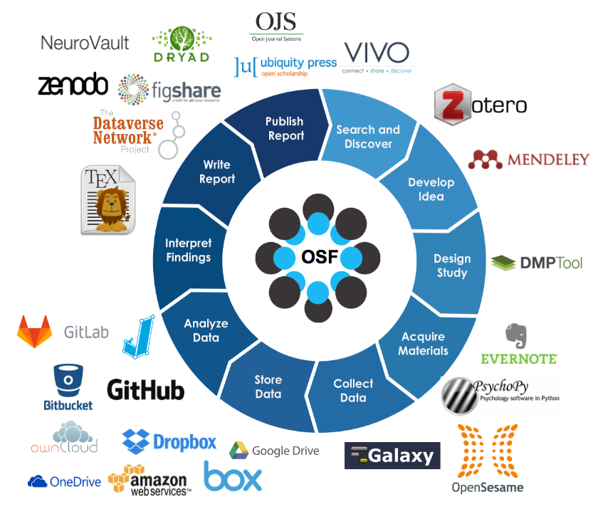
Image Credit: https://thriv.virginia.edu/center-for-open-science-open-science-framework/
The framework is developed by the Center for Open Science (COS), a non-profit organisation in the USA with the mission to increase the openness reproducibility and integrity of scientific research
The main tool that they build and maintain is the Open Science framework, called OSF, which is a free and open-source tool.
The design principle of the tool is to make it easy to practice open and reproducible research practices at all of the many stages of the research lifecycle.
Researchers are encouraged through the framework to start engaging with the idea of what material to share systematically and early on. Sharing publicly but also with collaborators before the manuscript editing phase.
Introduction to the OSF
One of the best ways to learn about the OSF is through a video provided by COS. The video is long (although you may watch it a increased speed), make sure you learn about the following features of OSF:
- Dashboard
- Create a project
- Give your project a structure
- How to add contributors and their roles and permissions
- Global unique identifiers
- Wiki and how to edit it
- Adding files and moving them within a project
- Version control that is embedded in OSF
- OSF and doi
You can find the video here.
Other tools: CRS primer
Other tools for collaboration have been summarized in the Primer “Digital collaboration” by the Center for Reproducible Science at the University of Zurich. The primer contains a few University of Zurich specific recommendations but is mostly applicable for anyone.
Quiz on the open science framework as a collaborative tool
Global unique identifiers
OSF distributes global unique identifiers
- only at the project level
- at the project, component and file level
- each time you make changes to a project
Solution
F only at the project level
T at the project, component and file level
F each time you make changes to a project
Wiki syntax
Wikis on OSF can be written in a “what you see is what you get” way and using the syntax of:
Solution
Markdown
Version control in OSF
Binary file types such as Word files or pdfs are version controlled on OSF through
- use of an online editor
- adding version indicators to file names
- recognition of file names in components
Solution
F use of an online editor
F adding version indicators to file names
T recognition of file names in components
3. What is version control and what is Git?
The purpose of Git is best explained with the below cartoon: it is a system that allows to avoid situations like in the cartoon. Such systems are called version control systems since they are designed to take care of versioning of files without changing (and lengthening) file names. The purpose here is not to teach you Git but to inform you detailed enough such that you can decide if or if not you need to learn Git. You will also learn a bit of terminology and get some links such that a start with Git should be easier.
 Image Credit: “Piled Higher and Deeper” by Jorge Cham at https://www.phdcomics.com. (permission requested)
What is Git?
- Git is:
- a version control system, i.e., tracks changes incl. timestamps
- the de facto standard
- open source, developed by Linus Torvalds in 2005
- Git runs on all major operating systems
- Several IDEs (Integrated Development Environments) available:
- RStudio
- Eclipse https://www.eclipse.org/
Git has a reputation to be complicated
Git is a tool that originated in software development and hence in order to use it a certain computer skill level is necessary. As a result it has a reputation to be complicated. Similar to code-based analysis there is indeed a certain learning curve in the beginning but with just a bit of practice the advantages outweigh the initial investment.

Image Credit: Randall Munroe/xkcd at https://xkcd.com/21597/ licensed as CC BY-NC.
Why use it anyhow?
- It provides a completely documented past
- Collaborators have coordinated access to the same documents
- It allows easy synchronization for local files (offline working)
- Tools to resolve conflicts for text based files are available
- and of course one can avoid file names like
masterManuscript_v4_rf_0812_gh.doc- (further benefits on a code development level)
More terminology
- A Git repository is a collection of files, typically organized as a project, managed with a version control.
- GitLab is a web-based tool that provides a Git repository manager, see e.g. the commercial https://www.gitlab.com. At the University of Zurich https://gitlab.uzh.ch/ and https://git.math.uzh.ch are available, maybe your institutions offers an instance as well?
- GitHub is a commercial provider of Internet hosting for software development and version control using Git: https://www.github.com
- The remote version of a repository can be “cloned” to the computers of all collaborators of the project.
Git is a decentralized version control system
Developers work directly with their own local repository on their computer, i.e. a folder on their computer: the local workspace in the below graphic.
By using the command “git add” they add files or folders to the local index, which is similar to a registry in a library. This step is also called staging. Then they “git commit” their staged changes to the local repository on their computer creating a version that will be kept in the system. Only with the “git push” command do they upload the changes to the remote server.
The next person working on the same repository will need to “git pull” the updated repository in order to access the changes.
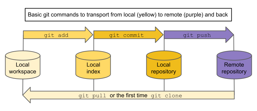 Image Credit: Illustration of the most important git commands by Eva Furrer, CC-BY, https://doi.org/10.5281/zenodo.7994551.
Installation
Open Rstudio, go to the terminal tab and type git --version to check if you already have Git installed.
If you do not have it go to https://git-scm.com/downloads and choose the correct operating system for the download.
When you are ready to run Git locally on your computer you can start using it together with a remote service (see above).
Want to know more?
Using Git with RStudio: http://r-bio.github.io/intro-git-rstudio/ and https://jennybc.github.io/2014-05-12-ubc/ubc-r/session03_git.html
Git book: https://git-scm.com/book/en/v2/
Tutorial: https://doi.org/10.1177/2515245918754826
Point-by-point instructions to connect with ssh https://docs.github.com/en/github/authenticating-to-github/connecting-to-github-with-ssh
Quiz on Git
Advantages
Why is a version control system useful when working on analysis scripts, even if working alone.
- Git allows you to review the history of your project.
- If something breaks due to a change, you can fix the problem by reverting to a working version before the change.
- Git retains local copies of repositories, resulting in fast operations.
- Git automatically scans for all changes and hence tracks everything.
Solution
T Git allows you to review the history of your project.
T If something breaks due to a change, you can fix the problem by reverting to a working version before the change.
F Git retains local copies of repositories, resulting in fast operations.
F Git automatically scans for all changes and hence tracks everything.
Episode challenge
In-classtask
First, we will add all participants to a common OSF project.
Task 1
We work on publicly available data from 13 weather stations in Switzerland: Sunshine duration, precipitation, temperature and fresh snow (1931 – 2022) and Ice days, frost days, summer days, heat days, tropical nights, precipitation days (1959 – 2022). We will collaboratively summarize the data into (approximatively) 30 year averages (see below) per station for each of the 10 available characteristics. Create a corresponding csv file with 14 columns including a column identifying characteristic and time period and one column per station and upload it to an OSF project in which all participants are members. Distribute the work of calculating averages and putting them into the common csv file in the group of participants.
Note: use the approximatve 30 year periods 1931 – 1958, 1959 – 1988, 1989 – 2022
Task 2
Add a Readme file to the project describing the content of the project, all participants agree on the wording and correct if necessary. Discuss the following questions. 1. What are the main difficulties when collaboratively editing the same file(s)? 2. What are the advantages in using text based files such as .R, .csv and .md files? and add the group’s thought in the Readme.
Key Points
Collaboration is fundamental for science, especially Open Science
Learning to use tools for collaboration is effective and helps to avoid problems
Reproducible notebooks for data analysis
Overview
Teaching: 60 min
Exercises: 120-150 minQuestions
Should I use a graphical user interface to analyse data or a code-based system?
What is literate programming and what is R Markdown?
How do I use R Markdown
Objectives
Understand the advantages of code-based data analysis
Able to create and adapt an R Markdown script
Adapt a YAML header
Use code chunks and choose the right chunk options
Practice R Markdown by answering simple questions
Bonus: add a table to an R Markdown script
1. Reproducibility of analysis code
Graphical user interface (GUI) vs. code
Statistical analysis software packages with graphical user interfaces such as SPSS (often) provide an easy solution to data analysis because
- one can get started with an analysis without much overhead in having to learn to code
- it is a convenient way of exploring the data
- figures and the statistical analysis are done at the end of the exploration
But it is often not clear anymore how exactly (and with which commands) those results were obtained and writing all steps down can be very tedious. Even if some kind of history of the executed commands is saved it might still be necessary to clean this up and keep only the relevant steps..
An analysis that is not reproducible can be an issue since
- it is easy to unintentionally introduce errors
- it is hard to get rid of errors
- if you need to change some step in the middle of the analysis you have to restart from scratch
- you can not provide a workflow that others (or yourself in the future) can follow easily to reproduce the results
On the other hand doing a statistical analysis purely with code is
- a lot of effort since all steps have to be written down explicitly
- needs some initial time investment in case of unfamiliarity
However, while it seems like a big hurdle modern programming languages designed for statistical computing, such as R, are usually pretty straightforward to learn and use, and they have a lot of advantages:
- Flexible: more combinations, functions and extensions are available
- Extensible (packages): in R, for example, thousands of packages are available.
- Reproducible (easily rerun from scratch)
- Mixing code and text increases readability
- Much more complete account of analysis than a methods section
- Start new projects from own or otherwise available code for similar analyses
R projects
Another very useful concept that enhances R’s usefulness via Rstudio are R Projects. They allow to
-
easily implement the folder structure that we heard about in the “First steps towards more reproducibility” episode (Organisation and software)
-
communicate between these directories because the correct working directory is set automatically
-
simplify collaborations since everybody can put their projects at desired location in their folder tree
-
quickly jump between different projects by remembering which files you had open and reopening them again
-
have more than one project open without mingling assigned variables etc.
Connected to the use of Project is the concept that you use relative file paths (e.g. for loading csv files). So instead of doing something like this: read.csv("/home/user/Documents/Uni/UnderstandingORS/Topic_5/data/example.csv") you write read.csv("data/example.csv"). This is easier to write, more flexible and less prone to errors because as long as you keep your files in the project together it will work. Imagine, for example, you want to move your script (and data) to "/home/user/backup/Uni/UnderstandingORS/Topic_5/data/example.csv".
Quiz on R projects
File path
Suppose your current working directory is ~/project and you want to specify the relative path to the file ~/project/data/data.csv . What are possible specifications?
- data.csv
- project/data.csv
- project/data/data.csv
- data/data.csv
Solution
F data.csv
F project/data.csv
F project/data/data.csv
T data/data.csv
2. Literate programming and R Markdown
R Markdown is a realisation of the literate programming concept mixing narrative text with analysis code which is then rendered into formatted text and analysis results (numbers, tables and graphics). The concept of literate programming goes back to Donald Knuth, see e.g. from the open-science-with-r carpentries course:
_ More generally, the mixture of code, documentation (conclusion, comments) and figures in a notebook is part of the so-called “literate programming” paradigm (Donald Knuth, 1984). Your code and logical steps should be understandable for human beings. In particular these four tips are related to this paradigm: _
- Do not write your program only for R but think also of code readers (that includes you).
- Focus on the logic of your workflow. Describe it in plain language (e.g. English) to explain the steps and why you are doing them.
- Explain the “why” and not the “how”.
- Create a report from your analysis using a R Markdown notebook to wrap together the data + code + text.
Parts of an R Markdown (.Rmd) file
Create a new Rmd
Execute the following steps on your computer while you read:
In Rstudio
- go to
File>New File>R Markdown - enter
TitleandAuthor - select
htmlas output - confirm
A new .Rmd file should open with a short tutorial.
To render, or knit, the file to html press Knit. The first time you run the script you will have to specify the name under which to save it. Afterwards the script is always saved before rendering.
YAML header
The YAML header of an R Markdown files contains the meta data that influence the final document in different ways. See the short summary from the open-science-with-r carpentries course:
_ The header of your R Markdown document will allow you to personalize the related report from your R Markdown document. The header follows the YAML syntax (“YAML Ain’t Markup Language”) which usually follows a
key:valuesyntax. _
For example, title: "titlename", where title is the key and "titlename" is the value.
The header itself starts with --- and stops with ---. For example:
---
title: "titlename"
output: html_output
---
More information about the YAML header can be found in the R Markdown cheat sheet.
Code chunks
The narrative text of a report is written in the simple Markdown syntax. Code chunks are specific to R Markdown. They contain R code that is to be executed when rendering the chunk or the entire file, i.e. including the data analysis.
To start a chunk write (backticks) ` {r} `, then place your R code and end the chunk with ` . The r in ```{r} ` indicates that the programming language used in this chunk is R. Other options include python or bash although we will not need these here.
Within RStudio a new code chunk can be included by either clicking on Insert a new code chunk in the toolbar or using a keyboard shortcut (Ctrl+Alt+I on Windows and Option+Command+I on Mac).
Each chunk can be run separately. To run the code in an individual chunk click on the green arrow (Run Current Chunk) on the right side of the chunk.
Alternatively use the keyboard shortcut Ctrl+Alt+T (Windows) or Option+Command+T (Mac) to run the current chunk (i.e. where your cursor is located). This runs only the code in the specific chunk but does not render the entire file.
For more options see the cheat sheet in R studio: Help > Cheat Sheets > R Markdown Cheat Sheet or the link above.
The behavior of code chunks can be changed by setting chunk options. This is done in the opening of the chunk, e.g. ` ```{r, echo=FALSE}`, which hides the code of this chunk (while still evaluating it). For more options see the R Markdown cheat sheet or the R Markdown Cookbook.
Note: inline R code, i.e. code directly within the narrative text, can be run with `r ` , placing the code after r . This is for example useful when you mention a sample size in the text and want it to update directly from the data set you read in.
Quiz on literate programming and R Markdown
Literate programming
Which of the following statements about literate programming are true?
- Literate programming combines code and text.
- Literate programming makes your code run more efficient.
- Literate programming makes your analysis easier to understand.
- Code should only be shown if necessary.
- Plots should not be included.
Solution
T Literate programming combines code and text.
F Literate programming makes your code run more efficient.
T Literate programming makes your analysis easier to understand.
F Code should only be shown if necessary.
F Plots should not be included.
YAML header: author
How do you specify the author in an R Markdown document?
- author: “name”
- Author: “name”
- Author = “name”
- Author: ‘name’
- author: name
Solution
T author: “name”
F Author: “name”
F Author = “name”
F Author: ‘name’
T author: name
YAML header: date
How do you set the date?
- Date: 01/01/2021
- Date = 01/01/2021
- datum: 01/01/2021
- date: 01/01/2021
Solution
F Date: 01/01/2021
F Date = 01/01/2021
F datum: 01/01/2021
T date: 01/01/2021
Chunk options
How do you prevent code from evaluation in a chunk?
- evaluate=FALSE
- eval=FALSE
- noeval=TRUE
- hinder=TRUE
- hind=TRUE
- interpret=FALSE
- inpr=FALSE
Solution
F evaluate=FALSE
T eval=FALSE
F noeval=TRUE
F hinder=TRUE
F hind=TRUE
F interpret=FALSE
F inpr=FALSE
Chunk options: figure height
How do you adjust the figure height?
- figure_height=100
- figureheight=100
- heightfigure=100
- fig_height=100
- fig.height=100
- height.fig=100
Solution
F figure_height=100
F figureheight=100
F heightfigure=100
F fig_height=100
T fig.height=100
F height.fig=100
R Markdown Practice
Modify the template found here by performing the following steps:
- add author and date to YAML header
- rename the first chunk to
print_chunk_nr_1- set the chunk options of chunk 2 to not show the code
- set the chunk options of chunk 3 to not evaluate the code but show it
- set the chunk options of chunk 4 to not show the warning
- complete the sentence at the end with appropriate information calculated in chunk 5
After these steps answer the questions:
- The percentage of children who survived the Titanic accident was (Note: round to one decimal digit)
- The percentage of female survivors was ___ times higher as the percentage of male survivors. (Note: round to two decimal digits)
Solution
- 52.3
- 3.45
Episode challenge
The goal of this challenge is to create a fully reproducible analysis within an R Markdown script which is easy to understand and read. For that, describe what you do and do not forget nice formatting. For example try different Markdown syntax (Headers, …), figure captions (Hint: check the chunk options for this), a meaningful YAML header, etc.
Analysis of the palmer penguins data
Create a new R Markdown document and write the code for each of the below questions in a separate paragraph/chunk and describe the result in a complete sentence directly in the R Markdown document. We will use the
penguinsdataset from the packagepalmerpenguins, available as the data setpenguinsafter installing the package. To get an overview of the data load thepenguinsdataset and explore the following questions:
Question 1
Find the the source of the
penguinsdataset together with the url to the data repository. Hint: run?penguinsSolution 1
library(palmerpenguins)Can I put ?penguins in the chunk?
The source is: Adélie penguins: Palmer Station Antarctica LTER and K. Gorman. 2020. Structural size measurements and isotopic signatures of foraging among adult male and female Adélie penguins (Pygoscelis adeliae) nesting along the Palmer Archipelago near Palmer Station, 2007-2009 ver 5. Environmental Data Initiative. doi: 10.6073/pasta/98b16d7d563f265cb52372c8ca99e60f
Gentoo penguins: Palmer Station Antarctica LTER and K. Gorman. 2020. Structural size measurements and isotopic signatures of foraging among adult male and female Gentoo penguin (Pygoscelis papua) nesting along the Palmer Archipelago near Palmer Station, 2007-2009 ver 5. Environmental Data Initiative. doi: 10.6073/pasta/7fca67fb28d56ee2ffa3d9370ebda689
Chinstrap penguins: Palmer Station Antarctica LTER and K. Gorman. 2020. Structural size measurements and isotopic signatures of foraging among adult male and female Chinstrap penguin (Pygoscelis antarcticus) nesting along the Palmer Archipelago near Palmer Station, 2007-2009 ver 6. Environmental Data Initiative. doi: 10.6073/pasta/c14dfcfada8ea13a17536e73eb6fbe9e < Originally published in: Gorman KB, Williams TD, Fraser WR (2014) Ecological Sexual Dimorphism and Environmental Variability within a Community of Antarctic Penguins (Genus Pygoscelis). PLoS ONE 9(3): e90081. doi:10.1371/journal.pone.0090081
Question 2
Create a Markdown table describing the
penguinsdata: for each numeric column in the dataset create a row in the table which should consist of the following columns:Column_Name,Mean,Variance
Hint: Checkout the functionknitr::kableand the chunk optionresults='asis'.Solution 2
numericcols <- sapply(colnames(penguins), function(x) is.numeric(penguins[[x]]))
df <- data.frame(Column_Name = names(numericcols)[numericcols],
                 Mean = signif(apply((na.omit(penguins[numericcols])), 2, mean), 4),
                 Variance = signif(apply((na.omit(penguins[numericcols])), 2, var), 4),
                 row.names = NULL
                 )
knitr::kable(df)
Column_Name Mean Variance bill_length_mm 43.92 2.981e+01 bill_depth_mm 17.15 3.900e+00 flipper_length_mm 200.90 1.977e+02 body_mass_g 4202.00 6.431e+05 year 2008.00 6.678e-01
Question 3
How many rows does the
penguinsdataset have?Solution 3
result_question_3 <- dim(penguins)[1]The data set has 344 rows.
Question 4
What is the first year of records in the data set?
Solution 4
result_question_4 <- min(penguins$year)The first year of records is 2007.
Question 5
What is the total number of Adelie penguins?
Solution 5
result_question_5 <- sum(penguins$species == "Adelie")The total number of Adelie penguins is 152
Question 6
What is the total number of missing values (
NA)?Solution 6
result_question_6 <- sum(is.na(penguins))The total number of missing values (NA’s) is 19.
Question 7
What is the total number of rows with no missing values?
Solution 7
result_question_7 <- sum(apply(penguins, 1, function(x) !any(is.na(x))))The number of complete rows (rows with no missing values, i.e. NA’s) is
rresult_question_7.
Question 8
On which islands were the Gentoo penguins found?
Solution 8
result_question_8 <- unique(penguins$island[penguins$species == "Gentoo"]);The name of islands where the Gentoo penguins were found is Biscoe.
Question 9
What is the proportion of Adelie penguins on Dream island (compared to all penguins on Dream island)?
Solution 9
result_question_9 <- sum(penguins$species == "Adelie" &
                           penguins$island == "Dream") /
                      sum(penguins$island == "Dream")
The proportion of Adelie penguins on Dream island is 0.4516129.
Question 10
What is the 93% quantile of the bill lengths in mm?
Solution 10
result_question_10 <- quantile(na.omit(penguins$bill_length_mm), 0.93)The 93 % quantile of
bill_length_mmis 51.3.
Question 11
What is the absolute mean difference of bill depth in mm between female and male penguins?
Solution 11
result_question_11 <- abs(coef(lm(bill_depth_mm ~ sex, penguins))[2])The absolute mean difference of
bill_depth_mmbetween female and male is 1.4656169.
Question 12
What is the 95% confidence interval of the slope of the linear regression with intercept of bill depth regressed on sex? Result will be a vector of two elements, e.g.
c('lower_limit', 'upper_limit').Solution 12
result_question_12 <- confint(lm(bill_depth_mm ~ sex, penguins), "sexmale" )The 95% confidence interval of the slope of the linear regression between
bill_depth_mmandsexis 1.0710254, 1.8602083
Question 13
What is the proportion of Chinstrap penguins with flipper length in mm smaller than 205 and bill length in mm larger than 45 compared to all penguins with flipper length in mm smaller than 205 and bill length in mm larger than 45?
Solution 13
chins <- na.omit(penguins$species[penguins$flipper_length_mm < 205 &
                                    penguins$bill_length_mm > 45])
result_question_13 <- sum(chins == "Chinstrap") / length(chins)
The proportion of Chinstrap penguins with
flipper_length_mmsmaller than 205 andbill_length_mmlarger than 45 compared to all penguins withflipper_length_mmsmaller than 205 andbill_length_mmlarger than 45 is 0.9310345.
Question 14
What is the proportion of Chinstrap penguins with
flipper_length_mmsmaller than 205 andbill_length_mmlarger than 45 compared to all Chinstrap penguins?Solution 14
result_question_14 <- sum(chins == "Chinstrap") / sum(penguins$species == "Chinstrap")The proportion of Chinstrap penguins with
flipper_length_mmsmaller than 205 andbill_length_mmlarger than 45 compared to all Chinstrap penguins is 0.7941176.
Bonus challenge
R Markdown tables
For the following challenge we will use the package
kableExtrawhich extends the base capabilities ofknitr::kableto create tables. From the package vignette:_ The goal of kableExtra is to help you build common complex tables and manipulate table styles. It imports the pipe
%>%symbol from magrittr and verbalize all the functions, so basically you can add “layers” to a kable output in a way that is similar with ggplot2 and plotly._For users who are not very familiar with the pipe operator
%>%in R: it is the R version of the fluent interface. The idea is to pass the result along the chain for a more literal coding experience. Basically, when we say A%>%B, technically it means sending the results of A to B as B’s first argument.Simple tables can be generated as follows:
library(kableExtra)
head(penguins) %>% # the dataset, '%>%' parses the output of this command as the input in the next >command
 kbl() %>% # the kableExtra equivalent of knitr::kable, base table
 kable_classic() # add theme to table
species island bill_length_mm bill_depth_mm flipper_length_mm body_mass_g sex year Adelie Torgersen 39.1 18.7 181 3750 male 2007 Adelie Torgersen 39.5 17.4 186 3800 female 2007 Adelie Torgersen 40.3 18.0 195 3250 female 2007 Adelie Torgersen NA NA NA NA NA 2007 Adelie Torgersen 36.7 19.3 193 3450 female 2007 Adelie Torgersen 39.3 20.6 190 3650 male 2007 For all options check the documentation or the vignette.
Task 1 Create the following table:
species 2007 2008 2009 2007 2008 2009 Adelie 38.8 38.6 39.0 18.8 18.2 18.1 Chinstrap 48.7 48.7 49.1 18.5 18.4 18.3 Gentoo 47.0 46.9 48.5 14.7 14.9 15.3 Hint: checkout the different styling functions, e.g.
kable_classic.
Hint: For multiple column names useadd_header_above
Hint: Use the following code to get started.Solution
df_sum <- penguins %>%
  dplyr::select(-sex, -island, -flipper_length_mm, -body_mass_g) %>%
  dplyr::group_by(species, year) %>%
  dplyr::summarise(dplyr::across(.fns = function(x) signif(mean(na.omit(x)), 3))) %>%
  tidyr::pivot_wider(names_from = c(year), values_from = c(bill_length_mm, bill_depth_mm))

df_sum %>%
  kbl(col.names = c("species", rep(c("2007", "2008", "2009"), 2)))%>%
  kable_classic() %>%
  add_header_above(c(" " = 1, "bill length [mm]" = 3, "bill depth [mm]" = 3)) %>%
  kable_styling(bootstrap_options = c("hover")) %>%
  column_spec (c(1, 4), border_right = T)
Task 2 Create the following table wich includes small graphs:
species mean boxplot histogram mean boxplot histogram Adelie 38.8 18.3 Chinstrap 48.8 18.4 Gentoo 47.5 15.0 Hint: Use
column_specfor altering specific columns.Solution
df_sum <- penguins %>%
  dplyr::select(-island, -sex, -year, -body_mass_g, -flipper_length_mm) %>%
  dplyr::group_by(species) %>%
  dplyr::summarise(dplyr::across(.cols = !contains("species"),
                                 .fns = function(x)
                                   signif(mean(na.omit(x)), 3))) %>%
  dplyr::mutate(bill_length_boxplot = "", bill_length_hist = "",
                bill_depth_boxplot = "", bill_depth_hist = "")

dfsum_list <- split(penguins$bill_length_mm, penguins$species)
dfsum_list2 <- split(penguins$bill_depth_mm, penguins$species)
df_sum %>%
  dplyr::select(species,
                dplyr::starts_with("bill_length"),
                dplyr::starts_with("bill_depth")) %>%
  kbl(col.names = c("species", rep(c("mean", "boxplot", "histogram"), 2))) %>%
  kable_paper() %>%
  column_spec(1, border_right = TRUE) %>%
  column_spec(3, image = spec_boxplot(dfsum_list)) %>%
  column_spec(4, image = spec_hist(dfsum_list), border_right = T) %>%
  column_spec(6, image = spec_boxplot(dfsum_list2)) %>%
  column_spec(7, image = spec_hist(dfsum_list2)) %>%
  add_header_above(c(" " = 1, "bill length [mm]" = 3, "bill depth [mm]" = 3),
                   border_right = TRUE, border_left = TRUE)
Key Points
Code-based analysis is better for reproducibility.
Combining narrative and code-based results is even more profitable.
Code chunks in R Markdown provide an easy solution
Reproducible and honest visualizations
Overview
Teaching: 90 min
Exercises: 90-120 minQuestions
How to create graphs reproducibly?
How to transmit information truthfully in graphs?
What are the good practice principles for visualizations?
Objectives
Learn about dos and donts for honest graphs
Learn about good practice for visualizations
Apply the principles to concrete examples
Learn the necessary R code
Data visualization
Data visualization is omnipresent in science. Visualizations range from presenting raw data to illustrating analysis results or modeling outcomes. The way visualizations are constructed should, as any other part of the analysis, be reproducible and adhering to the basic principles of good scientific practice. For visualizations it is specifically important to honestly show the data without distorting the contained information towards an intended message, i.e. we present how to transmit information as truthfully as possible in graphs. You will practice reproducible data analysis skills while learning about best practice for graphs.
Good practice for visualizations
In the following sections we will have a look at different visualizations and things to be aware of when using them with the goal of transmitting information truthfully. The most important principles of good practice for visualizations are
1. Be simple, clear and to the point
2. Show the data
3. Be honest about the axes
4. Use colors sensibly
We provide code in ggplot. A short introduction to ggplot is provided in this episode of the carpentries course: R for Social Scientists. A good reference for both systems, plots in base R and ggplot is the book by RD Peng: Exploratory data analysis with R.
1. Be simple, clear and to the point
Encoding data using visual cues
As a basic principle it is useful to consider the relationship of visual cues, i.e. the type of visual encoding of quantitative data such as bars or areas, and the accuracy of the understanding of a viewer of these visualizations. The graph below shows how accurately the visualizations are perceived for different types of representation. Lengths (in form of bars) represent the data most accurately while volumes are rather generic and are more difficult to be perceived accurately.
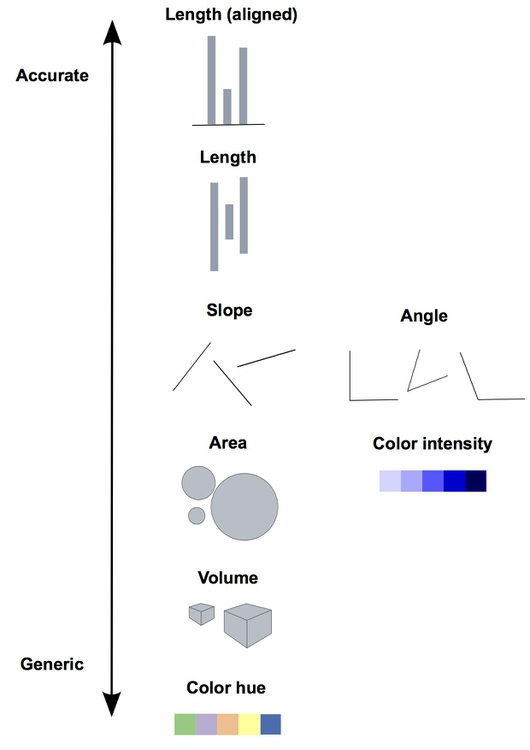 Image credit: P Aldhous
The linked picture is based on Graphical Perception: Theory, Experimentation, and Application to the Development of Graphical Methods by William S. Cleveland and Robert McGill.
Therefore, when creating a visualization you should consider the best type of visual cue that represents the data best with the goal of transmitting the intended message. For good perception of a message it is clearly better to provide simple visualizations. We discuss some specific points in more detail below.
3D
Providing simple and easily perceptible visualizations implies that you should avoid 3-dimensional graphical representations in most circumstances. Consider the following visualization:
Image credit: Josh Taylor
As you can see (or not see!) some data is hidden behind the different bars. Furthermore it is rather difficult (and misleading) to compare the height from different depths.
Avoid occlusion
As a general principle we can conclude from the 3D example that you should always avoid occlusion of some parts of the visualization. An example can be found in the following plot showing multiple densities in the same panel. The different densities where colored according to group but only the density in the front is fully visible.
An alternative is to plot lines which allows us to see all groups completely.
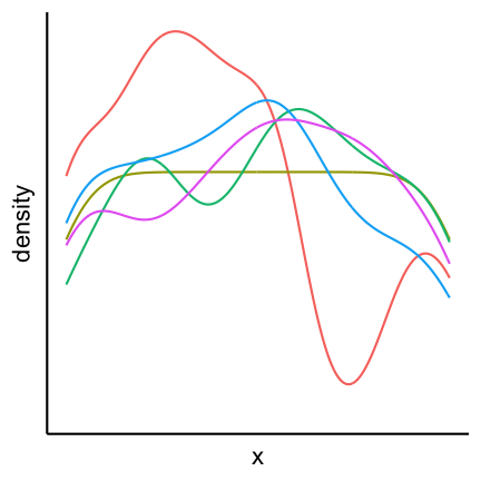
Pie charts
Pie charts can be considered an alternative to bar charts, although often not a good one since they use angles as visual cues. For instance look at the following three visualizations of a change of the count of three factors over time. First a barplot, second a stacked barplot and lastly three pie charts (on top of each other). Where are differences most visible?

Arrangement of plots
The arrangement of multiple plots and panels can also contribute to increasing the clarity of a visualization. Have a look at the following plot.

Two inconsistencies are present. First of all the order of the sample of the top row and the bottom row is not the same. Secondly in the top row var1 is on the y-axis while in the bottom row it is on the x-axis. Staying consistent and in general have an arrangement that makes sense helps to have a clear representation that transmits the desired information efficiently. A better alternative for the above plot is:

2. Show the data
Boxplots
Boxplots are used to give a rough overview of the distribution of a data set based on a few summary characteristics (quantiles). Consider the following three boxplots each representing a different dataset. The boxplots look identical even tough the underlying distributions may not be.
The code for the above plot:
ggplot(df_long) +
  geom_boxplot(aes(y = y, x = dataset))
Violin plots are an alternative to boxplots. They are based on an estimation of the underlying probability density, i.e. they use more information inherent in the data set. Have a look at the following three violin plots of the same datasets as above. Again, two of the violin plots look similar but the underlying data may not be identical.

Let’s finally have a look at the actual data. As you can see the samples x1 and x3 are in fact very distinct, or more precisely, x3 seems to have only 5 possible values.
So why did the boxplot not show the distributional differences? Since boxplots only show certain quantiles (usually the quartiles, i.e., 25%, 50% and 75%, plus “outliers”) plots of different datasets having the same or similar quantiles appear identical. The quartiles of the three data sets are
| dataset | q25 | q50 | q75 |
|---|---|---|---|
| x1 | -2.1 | 0 | 2.1 |
| x2 | -2.0 | 0 | 2.0 |
| x3 | -2.0 | 0 | 2.0 |
Violin plots show a mirrored estimation of the underlying density using a smoothing technique. Loosely speaking smoothing means that starting from a histogram a smooth version of the underlying probability distribution is created. The degree of smoothing, ranging in this case from histogram to straight line, determines the actual appearence of the plot. For the violin plot the degree of smoothing is chosen automatically. Already histograms with 5 bins for the data x1 and x3 would be very similar and hence the smoothed versions thereof as well.
Caution is furthermore advised if the datasets that are compared are of very different size, because often more data gives you a higher confidence in the observed distribution. It is therefore advised to initially always have a look at the actual data and not just the summaries (like boxplots and violin plots) to detect anomalies.
Another option is the use of geom_jitter (or geom_sina from the ggforce package) in combination with violin plots:
The code for the above plot:
ggplot(df_long) +
  geom_violin(aes(y = y, x = dataset)) +
  geom_jitter(aes(y = y, x = dataset), width = 0.3)
The advantage is that individual points as well as the distribution are shown.
Boxplots together with geom_jitter are another possibility.

Another possibility is to only show the jittered data:

Bar plots
The same as discussed before for boxplots also holds for barplots. If you have continuous data and see the following barplots you might conclude that the data sets are the same:

But if you also show the individual points you can see clear differences:
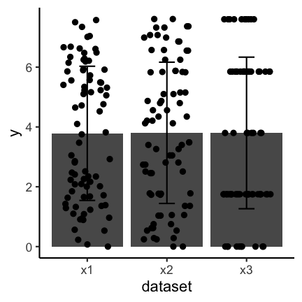
Important to keep in mind when using barplots with error bars is to state what the error bars mean. Do they correspond to the standard deviation, the standard error or a confidence interval? There is no clear answer to which one to use and, if possible, other types of visualizations should be used.
3. Be honest about the axes
The axes of plots determine how much information you provide and where you put the focus. You could cut axes, blow certain parts of an axis up through transformation or hide information on certain scales if you do not transform. You can expose or hide information by choosing the aspect ratio between the x and y axis. You can provide clear and precise information through meaningful labeling of axes and axis tick marks or you can obscure the same information by deliberately choosing uninformative tick locations, for example. These issues are illustrated through example in the following
Cutting axes
Let’s consider the following two barplots. The first has a shortened axis range and shows clear differences between the datasets. The second plot on the other hand shows the enire axis starting from zero and the differences disappear.
See this concrete example of cutting an axis, which makes differences appear much huger than they are in reality:
 Image credit: Helena Jambor
Axis transformation
In some cases you might have data that is on completely different scales, meaning that there are differences to be seen at different orders of magnitudes. In these cases it can often to be helpful to do an axis-transformation. For instance consider the following untransformed plot:
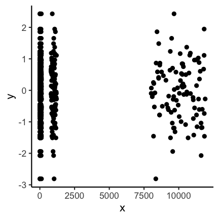
There seems to be some structure but especially for the low values it is not clear
what is going on. If instead you do a log10 transformation of the x-axis things get
much clearer. Axis transformations are also something to consider if you have for example
non linear scales. But beware, transformations can also be used to showcase differences that do not really matter in practice.
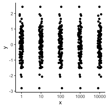
Aspect ratio
The aspect ratio is another important parameter that can be manipulated to overstress certain patterns. For example, have a look at the following two plots. The first as a ratio of one, meaning the scale of the x and y axis are the same. The second plot has an aspect ration of 1/4 meaning the x axis is substantially longer.

Code for the above plot:
ggplot(df) +
  geom_point(aes(x, y)) +
  coord_fixed(ratio = 1)
ggplot(df) +
  geom_point(aes(x, y)) +
  coord_fixed(ratio = 1 / 4)
Visually the second plot implies that the variance of x is much higher than of y, which is not the case:
summarise(df, x = var(x), y = var(y))
          x         y
1 0.8332328 0.9350631
Also consider the following real example. Where does the increase look the most dramatic?

Image credit: Demetris Christodoulou
Bin width of histograms
The appearance of a histogram is determined by the bin width that is used to create it. If you have a very large binwidth (or a low total number of bins) you might see something like this and you would probably consider the distribution to be approximately uniformly distributed.
If on the other hand you decrease the binwidth (or increase the number of bins) you might see something like this:
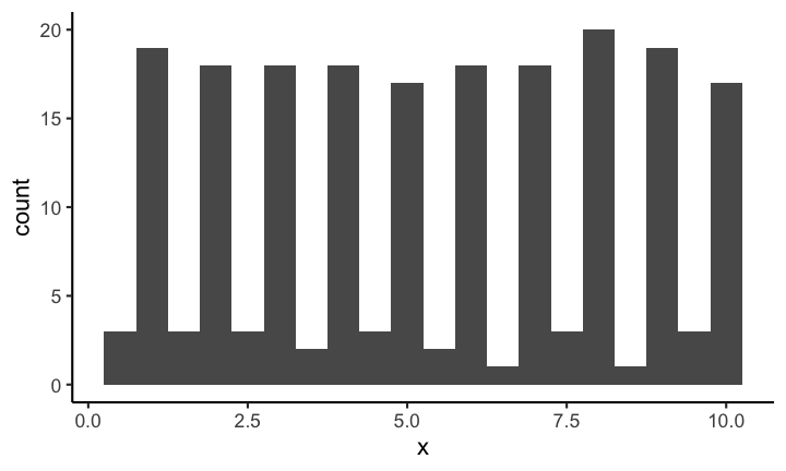
Making it quite obvious that the distribution is most definitely not uniformly distributed (on this scale). Choosing the correct bin width is not easy and depends largely on the context.
With geom_rug you can mark the position of individual observations:

Code for the above plot:
ggplot(df, aes(x)) +
  geom_histogram(binwidth = 0.5) +
  geom_rug()
Axis scales in multiple plots
If you provide plots in multiple panels, each using the same variables, you need to pay attention to the scale of each subplot. For example have a look at the following plot.
At first glance the distribution of each of the three samples looks the same. But if you look closely you can see that the scales are not the same for each subplot. If you instead keep the scale the same across subplots you get a visualization with clear differences of the distributions between the different samples.
Code for the above plot:
ggplot(df) +
  geom_point(aes(x, y)) +
  facet_wrap( ~ sample)
4. Use colors sensibly
Color contrast
Trying to encode more than 8 category with colors is usually not a good idea as distinction between colors can become very difficult:
In such a case it can be a better idea to directly label the points:

Code for the above plot:
mtcars %>%
  rownames_to_column() %>%
  ggplot() +
  geom_point(aes(mpg, disp, color = cyl)) +
  ggrepel::geom_label_repel(aes(mpg, disp, label = rowname),
                            size = 2.5, label.size = 0.1,
                            label.padding = 0.1)
See also: Common pitfalls of color use in Fundamentals of Data Visualization.
Color vision deficiency
About 1 of every 12 people is affected by some type of color vision deficiency (see, e.g., here). This is important to keep in mind when choosing colors for visualizations. For example consider the following scatter plot using a Red-Yellow-Green color palette, knowing that Red-Green colorblindness is the most frequent type of color deficiency.
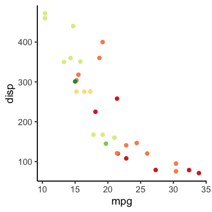
To check how the plots appear for color deficient persons you can use the cvd_grip function from the colorblindr package (install instructions on the Github colorblindr repo).
colorblindr::cvd_grid() +
  medtheme()
Using a different color palette can help. For example the following:
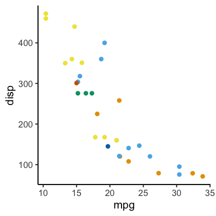
Code for the above plot:
ggplot(mtcars) +
  geom_point(aes(mpg, disp, color = factor(carb))) +
  scale_color_OkabeIto()
Another option is the dichromat package (CRAN link) which features multiple palettes for people with red-green colorblindness.
Quiz
Let’s have a look at the graph, :
 Image credit: We discovered the graph here:
https://statmodeling.stat.columbia.edu/2008/06/06/new_candidate_f/. The picture is not from a scientific study but originates from a blog: http://www.shakesville.com/2007/09/rotundity-revealed.html.
Image credit: We discovered the graph here:
https://statmodeling.stat.columbia.edu/2008/06/06/new_candidate_f/. The picture is not from a scientific study but originates from a blog: http://www.shakesville.com/2007/09/rotundity-revealed.html.
1
What aspect of the “Be simple, clear and to the point” input has been violated?
- 3D
- occlusion
- use of pie charts
- arrangement of multiple plots
Solution
T 3D
T occlusion
F use of pie charts
F arrangement of multiple plots
2
Is the data shown appropriately by the plot through
- the height of bars?
- the values on bars?
- additional values in white font?
- the tick marks indicating to which value each bar belongs?
- the raw data?
Solution
- the height of bars?
- the values on bars?
- additional values in white font?
- the tick marks indicating to which value each bar belongs?
- the raw data?
3
What could be the reason that the Y-axis is shown starting at the value 55?
- the value 55 could be the smallest possible value in the context
- the differences between the bars are more pronounced than if the Y-axis starts at zero.
- the values below 55 need to be hidden
Solution
T the value 55 could be the smallest possible value in the context
T the differences between the bars are more pronounced than if the Y-axis starts at zero.
T the values below 55 need to be hidden
4
When you think about the information regarding the axes, please tick which one of the following items is present in the plot
- Sensible X-axis tick label display
- Sensible X-axis label
- Sensible Y-axis tick values
- Sensible Y axis label
Solution
F Sensible X-axis tick label display
F Sensible X-axis label
F Sensible Y-axis tick values
F Sensible Y axis label
5
Does the displayed grid help to determine the height of the color sections of the bars?
- Yes
- No
Solution
F Yes
T No
6
Is the used color palette color-blind friendly?
- Yes
- No
Solution
F Yes
T No
7
Which of the following additional information items does the plot feature?
- Informative title
- Informative legend labels
- Provenance of data
- Context of data
Solution
F Informative title
F Informative legend labels
F Provenance of data
F Context of data
8
Does the course team think this is a good plot?
- Yes
- No
Solution
F Yes
T No
Episode challenge
For this challenge we will work with climate data published by the Bundesamt für Statistic BFS in which various climate related variables measured at different locations in Switzerland have been put together. The data has already been wrangled into a csv file that you can download from here.
The source data was downloaded from here: https://www.bfs.admin.ch/asset/de/je-d-02.03.03.02 and here: https://www.bfs.admin.ch/asset/de/je-d-02.03.03.03
Task 1: data exploration
In this first task read in the climate_data.csv file and do a short exploration of the dataset.
1.1 First look
Show the top 3 rows of the dataset and additionally a short summary of the dataset (Hint: use summary). Describe what you observe in a few words.
Solution
head(climatedf_comp, n = 3)Year Location Sunshine_duration Altitude Annual_Precipitation 1 1931 BaselBinningen 1594.317 316 816.0 2 1931 BernZollikofen 1742.500 553 1137.6 3 1931 Davos 1767.600 1594 1077.3 Annual_temperature Annual_ice_days Annual_frost_days Annual_summer_days 1 8.5 NA NA NA 2 7.2 NA NA NA 3 1.7 NA NA NA Annual_heat_days Annual_tropic_days Annual_precipitation_days 1 NA NA NA 2 NA NA NA 3 NA NA NAsummary(climatedf_comp)Year Location Sunshine_duration Altitude Min. :1931 Length:1170 Min. :1046 Min. : 273.0 1st Qu.:1953 Class :character 1st Qu.:1557 1st Qu.: 411.0 Median :1976 Mode :character Median :1725 Median : 485.0 Mean :1976 Mean :1759 Mean : 805.9 3rd Qu.:1998 3rd Qu.:1937 3rd Qu.: 776.0 Max. :2020 Max. :2741 Max. :2501.0 NA's :129 Annual_Precipitation Annual_temperature Annual_ice_days Annual_frost_days Min. : 338.9 Min. :-3.300 Min. : 0.00 Min. : 1.00 1st Qu.: 829.9 1st Qu.: 6.925 1st Qu.: 5.00 1st Qu.: 60.25 Median :1050.5 Median : 9.000 Median : 17.00 Median : 87.00 Mean :1212.9 Mean : 7.755 Mean : 33.05 Mean :107.99 3rd Qu.:1411.8 3rd Qu.:10.400 3rd Qu.: 41.00 3rd Qu.:120.00 Max. :3704.2 Max. :13.900 Max. :218.00 Max. :289.00 NA's :364 NA's :364 Annual_summer_days Annual_heat_days Annual_tropic_days Min. : 0.00 Min. : 0.000 Min. : 0.000 1st Qu.: 12.25 1st Qu.: 0.000 1st Qu.: 0.000 Median : 38.00 Median : 2.000 Median : 0.000 Mean : 36.95 Mean : 6.257 Mean : 1.561 3rd Qu.: 56.00 3rd Qu.:10.000 3rd Qu.: 1.000 Max. :125.00 Max. :56.000 Max. :40.000 NA's :364 NA's :364 NA's :364 Annual_precipitation_days Min. : 64.0 1st Qu.:100.0 Median :120.0 Mean :119.8 3rd Qu.:136.0 Max. :229.0 NA's :365
1.2 Which has been the hottest year?
Solution
climatedf_comp %>%
  dplyr::group_by(Year) %>%
  dplyr::summarise(mean_temp = mean(Annual_temperature)) %>%
  dplyr::filter(mean_temp == max(mean_temp)) %>%
  dplyr::pull(Year)
[1] 2018
1.3 Which has been the coldest year?
Solution
climatedf_comp %>%
  dplyr::group_by(Year) %>%
  dplyr::summarise(mean_temp = mean(Annual_temperature)) %>%
  dplyr::filter(mean_temp == min(mean_temp)) %>%
  dplyr::pull(Year)
[1] 1956
Task 2: visualization
2.1 Association of Annual_temperature and Year
The goal is to visualize the association of Annual_temperature and Year.
To increase the visibility we will only look at the locations ZürichFluntern, Säntis, Samedan, LocarnoMonti.
Choose a suitable visualization (maybe consider looking at the decision tree) and plot the respective graph.
Solution
climatedf_comp %>%
  dplyr::filter(Location %in% c("ZürichFluntern",
                                "Säntis",
                                "Samedan",
                                "LocarnoMonti")) %>%
  ggplot() +
  geom_line(aes(Year, Annual_temperature, color = Location)) +
  labs(y = "Annual temperature")
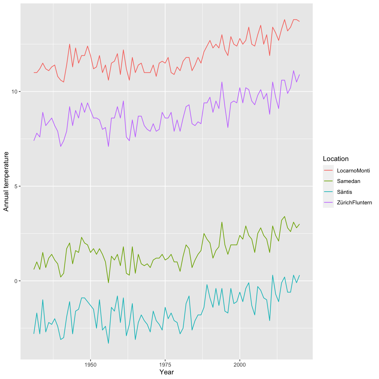
2.2 Add information on the altitude
Based on the previous plot update / change your plot to also include the information about the altitude. Make sure that the location information is also provided.
Solution
climatedf_comp %>%
  dplyr::filter(Location %in% c("ZürichFluntern",
                                "Säntis",
                                "Samedan",
                                "LocarnoMonti")) %>%
  ggplot() +
  geom_line(aes(Year, Annual_temperature, color = Altitude, group = Location)) +
  geom_label(aes(Year, Annual_temperature, label = Location),
             data = climatedf_comp %>%
               dplyr::filter(Location %in% c("ZürichFluntern",
                                             "Säntis",
                                             "Samedan",
                                             "LocarnoMonti")) %>%
               dplyr::filter(Year==min(Year)+5),nudge_y = 1) +
  labs(y = "Annual temperature")

2.3 Normalization
In the next step we want to normalize the Annual temperature by using the values of the years <1951 as a base. I.e. calculate the mean Annual_temperature for Year<1951 for each Location and subtract this value from Annual_temperature. Present a visualization that allows to study the deviation from this annual mean by location.
Solution
climatedf_comp_translated <- climatedf_comp %>%
  dplyr::filter(Location %in% c("ZürichFluntern",
                                "Säntis",
                                "Samedan",
                                "LocarnoMonti")) %>%
  dplyr::group_by(Location) %>%
  dplyr::mutate(mean_temperature = mean(Annual_temperature[Year < 1951]),
                Annual_temperature = Annual_temperature - mean_temperature)

ggplot(climatedf_comp_translated) +
  geom_line(aes(Year, Annual_temperature, color = Altitude, group = Location)) +
  facet_wrap( ~ Location) +
  # geom_label(aes(Year, Annual_temperature, label = Location),
  #            data = climatedf_comp_translated %>%
  #              dplyr::filter(Location %in% c("ZürichFluntern",
  #                                            "Säntis",
  #                                            "Samedan",
  #                                            "LocarnoMonti")) %>%
  #              dplyr::filter(Year == min(Year) + 5), nudge_y = 1) +
  labs(y = "Annual temperature deviation from average up to 1951")
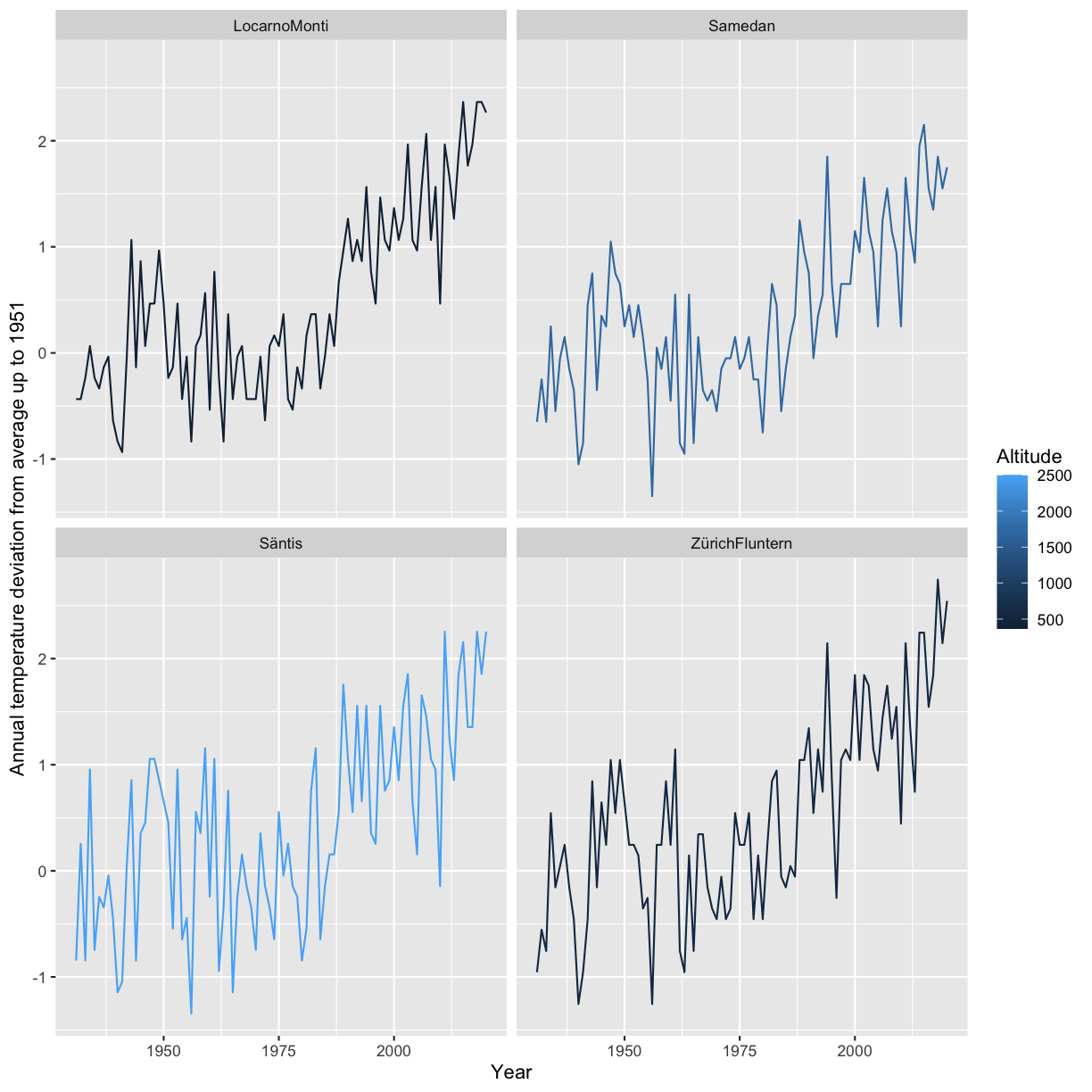
2.4 Associations between Annual_Precipitation, and Sunshine_duration
The next goal is to explore associations between Annual_Precipitation, and Sunshine_duration for the locations ZürichFluntern,Säntis,Samedan,LocarnoMonti. Present at least two different types of plots.
Solution
climatedf_comp %>%
  dplyr::filter(Location %in% c("ZürichFluntern",
                                "Säntis",
                                "Samedan",
                                "LocarnoMonti")) %>%
  tidyr::drop_na() %>%
  ggplot() +
  geom_point(aes(Annual_Precipitation, Sunshine_duration, color = Location))
climatedf_comp %>%
  dplyr::filter(Location %in% c("ZürichFluntern",
                                "Säntis",
                                "Samedan",
                                "LocarnoMonti")) %>%
  # dplyr::group_by(Location) %>%
  # dplyr::mutate(Sunshine_duration = scale(Sunshine_duration)) %>%
  tidyr::drop_na() %>%
  ggplot() +
  geom_violin(aes(Location, Annual_Precipitation, color = Sunshine_duration)) +
  ggforce::geom_sina(aes(Location, Annual_Precipitation, color = Sunshine_duration))
Warning: The following aesthetics were dropped during statistical transformation: colour ℹ This can happen when ggplot fails to infer the correct grouping structure in the data. ℹ Did you forget to specify a `group` aesthetic or to convert a numerical variable into a factor?
climatedf_comp %>%
  dplyr::filter(Location %in% c("ZürichFluntern",
                                "Säntis",
                                "Samedan",
                                "LocarnoMonti")) %>%
  # dplyr::group_by(Location) %>%
  # dplyr::mutate(Sunshine_duration = scale(Sunshine_duration))  %>%
  tidyr::drop_na() %>%
  ggplot() +
  geom_boxplot(aes(Location, Sunshine_duration, color = Annual_Precipitation)) +
  geom_jitter(aes(Location, Sunshine_duration, color = Annual_Precipitation))
Warning: The following aesthetics were dropped during statistical transformation: colour ℹ This can happen when ggplot fails to infer the correct grouping structure in the data. ℹ Did you forget to specify a `group` aesthetic or to convert a numerical variable into a factor?
# ggforce::geom_sina(aes(Location, Annual_Precipitation, color = Sunshine_duration))


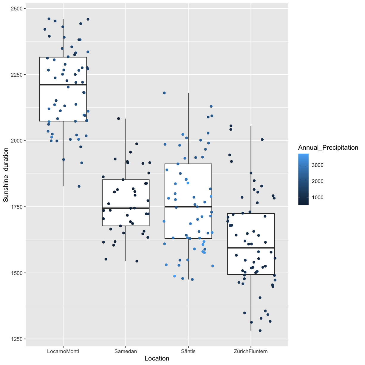
Bonus challenge
We have already shortly had a look at facets which allow to easily arrange multiple plots. But so far we have only considered the case where each subplot shows the same variables, e.g Sunshine_duration vs. Annual_frost_days. What if instead you would like to use facets to plot multiple variables? For instance you would like to do a plot containing two subplots, the first Annual_frost_days vs. Sunshine_duration and the second Annual_summer_days vs. Sunshine_duration?
There are basically two options:
- Do both plots separately and then combine them
- Do both plots simultaneously using facets
We will in the following explore both options.
Combine plots
There are many options available how to combine plots. Two useful packages are cowplot (for all graphics) and ggpubr (for ggplots). In this exercise we will use ggpubr.
Exercise 1
Create two ggplot2 scatterplots, Annual_frost_days vs. Sunshine_duration and Annual_summer_days vs. Sunshine_duration, color by location. Combine the two plots using ggpubr::ggarrange and make sure to have only one legend. Also make sure to have the same axis range in both plots.
Solution
minmax <- c(min=min(na.omit(c(climatedf_comp$Annual_frost_days,
                              climatedf_comp$Annual_summer_days))),
               max=max(na.omit(c(climatedf_comp$Annual_frost_days,
                                 climatedf_comp$Annual_summer_days))))
pl1 <- climatedf_comp %>%
  ggplot() +
  geom_point(aes(Annual_frost_days, Sunshine_duration, color = Location)) +
  xlim(minmax)+
  labs(x="Annual frost days",
       y="Sunshine duration")

pl2 <- climatedf_comp %>%
  ggplot() +
  geom_point(aes(Annual_summer_days, Sunshine_duration, color = Location)) +
  xlim(minmax)+
  labs(x="Annual summer days",
       y="Sunshine duration")

ggpubr::ggarrange(pl1, pl2, common.legend = TRUE)
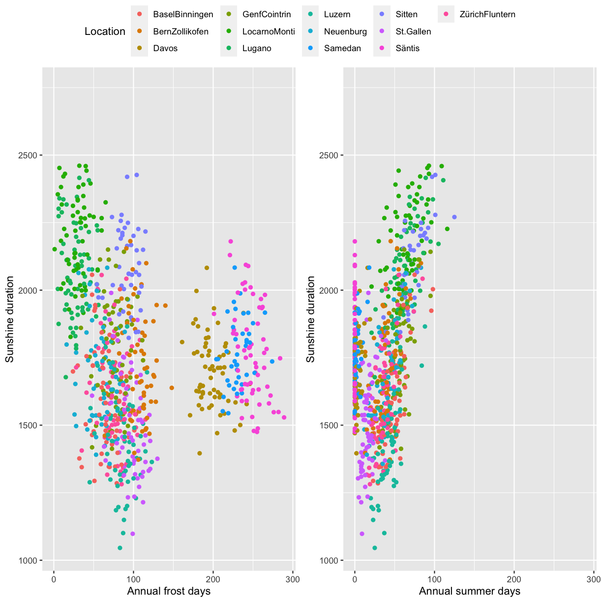
Facets
The second option is to use facets (e.g. ggplot2::facet_wrap). Since our data is
currently not in the correct format we first have to bring it into shape. This can be done using
tidyr::pivot_longer which transforms data from wide to long format. The wide format means we have multiple values per row while the long format means we only have a single value while the remaining
columns act as an identifier of the sample. You can learn more about pivot, long and wide formats by running vignette("pivot",package = "tidyr") in the console.
Exercise 2
Use tidyr::pivot_longer to bring the data into long format and plot Annual_frost_days vs. Sunshine_duration and Annual_summer_days vs. Sunshine_duration in the same plot using ggplot2::facet_wrap.
Hint: The columns to pivot into longer format are Annual_frost_days and Annual_summer_days.
Solution
climatedf_comp %>%
  dplyr::select(Location, Year, Sunshine_duration,
                Annual_frost_days, Annual_summer_days) %>%
  dplyr::rename(`Annual frost days` = Annual_frost_days,
                `Annual summer days` = Annual_summer_days) %>%
  tidyr::pivot_longer(cols = c("Annual frost days", "Annual summer days")) %>%
  ggplot() +
  geom_point(aes(value, Sunshine_duration, color = Location)) +
  facet_wrap( ~ name) +
  labs(x = "Days", y = "Sunshine duration")
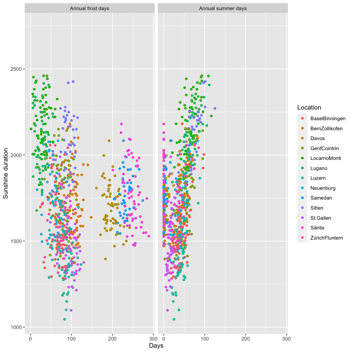
Optional: ggplot2 theme
Rotate axis text
In some situations where labels on the x-axis are long they can overlap with the default setting:

A solution can be to rotate the labels:

Reproduce the above plot.
Hint: use the argument axis.text.x in the theme function and make sure to check the expected input class in axis.text.x.
Solution
climatedf_comp %>%
  ggplot() +
  geom_violin(aes(Location, Sunshine_duration, color = Location)) +
  theme(axis.text.x = element_text(angle = 45, hjust = 1)) +
  labs(y = "Sunshine duration", x = "")
Custom colors
You can generate custom colors using RColorBrewer::brewer.pal. The generated colors can then be used in combination with scale_color_manual(values=generated_colors).
Solution
climatedf_comp_red <- climatedf_comp[climatedf_comp$Location %in%
                                       c("Luzern","ZürichFluntern","Lugano"), ]
colors_use <- RColorBrewer::brewer.pal(length(unique(climatedf_comp_red$Location)),
                                       "Set2")

climatedf_comp_red %>%
  ggplot() +
  geom_violin(aes(Location, Sunshine_duration, color = Location, fill = Location)) +
  scale_color_manual(values = colors_use) +
  scale_fill_manual(values = colors_use) +
  labs(y = "Sunshine duration", x = "")
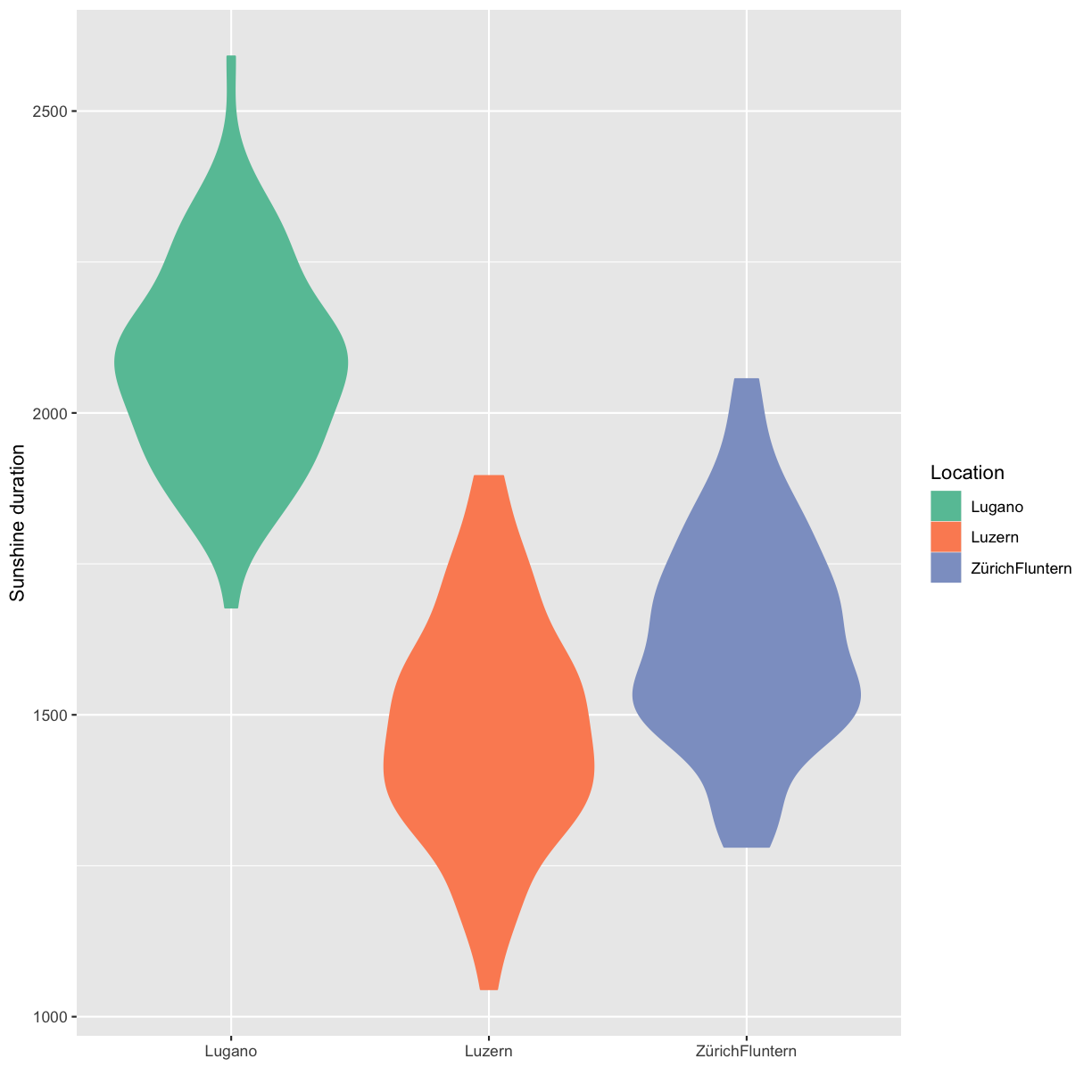
Key Points
Be simple, clear and to the point
Show the data
Be honest about the axes
Use colors sensibly